Hi All,
I’m new to Fontself but have a long time interest in typography especially what are usually called Display fonts. A little background should explain that.
My family has been in signwriting for generations and I started second-coating my father’s work when I was 12 years old, some 57 years ago. My father was well known for his craftsmanship in his native city and his work has been shown in a few books on the craft.
I have samples of three letters he did on card in a style he was most famous for. About seven years ago I started drawing vector based versions based on these. It has gone through various manifestations off and on over the seven years. Recently I decided I had to finish it and Fontself seemed to me the best option for sharing it with the world as a tribute to my father.
At this stage, having drawn all the characters and some glyphs, I am looking for general feedback, and I have some questions.
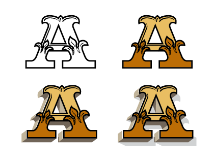
My idea would be to create a font, all caps, with the options of glyphs which include a “return” 3d element with shading and also a cast shadow as in the 3 sample A’s shown here.
Is this a good way to go?
Should I use colour?
If I use colour will prospective users be able to change colours to suit their projects?
All feedback is welcome. My father’s samples are the E, S & T.
Sorry for being a longwinded first time poster and my unconventional terms.
p.s. Just discovered new users can upload only one image

A beautiful letter and a beautiful tribute to your father! ![]()
It depends on how flexible you’d like the font to be and how much control over font colour you’d like users to have. You could create a colour font with the gylphs as you’ve shown here. Users wouldn’t be able to change the colour using type/character options, but they colour ‘expand’ the appearance after typing things out and recolour each section in illustrator.
If you want to give users full control of colour then you’d really need to create a standard font and split each character up into various weights: Black lines as weight one, The red section as weight 2, the yellow as weight 3 etc.
So maybe the best way for now is to create a colour font in three weights. The black, red and yellow as one weight. The brown 3d extrusion as weight 2 and the shadow as a third weight.
I hope that helps, even just a little.
Beautiful work! ![]()
Thanks very much @twinbrush for taking the time to read and your very valuable advice. I think I will go with the latter option you suggested.
I will continue with this but to familiarise myself with Fontself and how it works I am creating a typeface based on a “one-stroke” brushed letter which I will upload. This shouldn’t take too long and the experience would be most helpful for this project.
You’re most welcome @kpfreeney FontSelf is such a great plugin for font creation, I hope you enjoy using it! It’s been an absolute godsend for me. If you have any questions, reach out to the community here, or directly to Franz and the guys at FontSelf…super helpful. Obviously you’re welcome to ask me anything too..I might not have the answer, but more than happy to help if i can ![]()
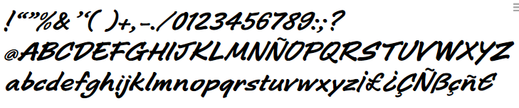
Hi again, I worked on the font based on scans of letters done with a felt pen and created it in Fontself. I was very pleased with the result although the kerning for certain letters and glyphs need tweaking.
Later, this summer I created all the characters for the 3d font in Illustrator. Having just reviewed them, I noticed improvements I could make and I’ve started again. I have done the letter “H”.
I uploaded the basic or regular “H” to Fontself and saved it. I typed in the “H” in illustrator and expanded it and was delighted with the result. All parts could be coloured separately which is just what I wanted.
I’m glad I left it for a few months and came back to it with a fresh eye. Looking forward to creating A,B,C,D…
This looks awesome! Looking forward to seeing more.
I’ve finally finished artwork and have uploaded first three versions.
Fontself has done a great job. I learned that any stray unfilled lines will mess everything up.
Some of the characters, such as “M” and “W” have an enormous number of nodes and had to be cut down. The final version/weight is going to be a challenge but who doesn’t love a challenge?