Hi, I created a font a while back that’s been working great in our InDesign compositions. Beautiful spacing and kerning, and everything looks great on output. Thanks for a great application, especially the Smart Spacing and Kerning tools. Awesome!
In the initial font I didn’t include any accented glyphs and it’s time now to do that. I created all the glyphs and imported them using the exact same Ascender, capHeight, xHeight, Baseline, and Descender guides, and successfully created kerning groups to duplicate spacing for similar glyphs (e for é, etc.). All good. They look great in InDesign and everything works as it should.
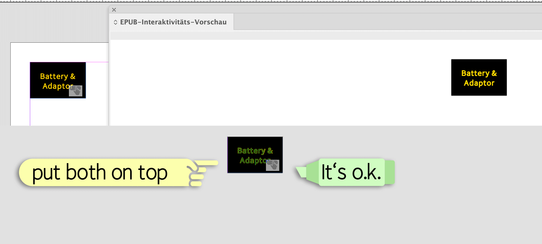
However! On export to fixed-layout epub from InDesign, the baseline shifts downward pretty dramatically, even though it displays correctly in InDesign. It’s not a huge issue with text blocks with large amounts of text, but when we have a small, formatted text box (a button, for example), it is a big problem, especially on two-line buttons.
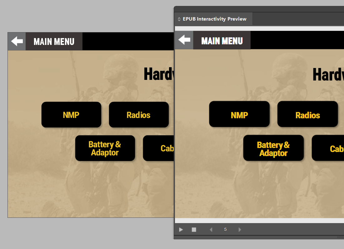
In the attached image, the text frames (the buttons) specify a vertical alignment that centers the text in the button from top to bottom. The image shows a screenshot with the InDesign display on the left and the Epub preview on the right. The downward shift on the right is clearly visible especially the two-line Battery & Adaptor button.
baseline_shift|689x500
The old font (before adding accented glyphs), shifted a little, but not nearly as much so it was not a deal-breaker. With the new font it definitely is a deal-breaker. I can’t figure out how to fix this, or if it’s even possible to fix… Any advice to help me solve this would be appreciated!
Can you share with us, me please the font - really exciting to see how it performs in INDD
I’m sorry but I can’t share it publicly.
Hello StartGuides,
I have recreated one of your buttons in InDesign with my Fontself font “TimeSaver One 70 Bold”. If I superimpose the two buttons in Photoshop, they can be described as congruent. See attachment (ZIP) below.
In your screenshot, however, there are differences in the width of the font in both buttons. The spacing of both lines is the same.
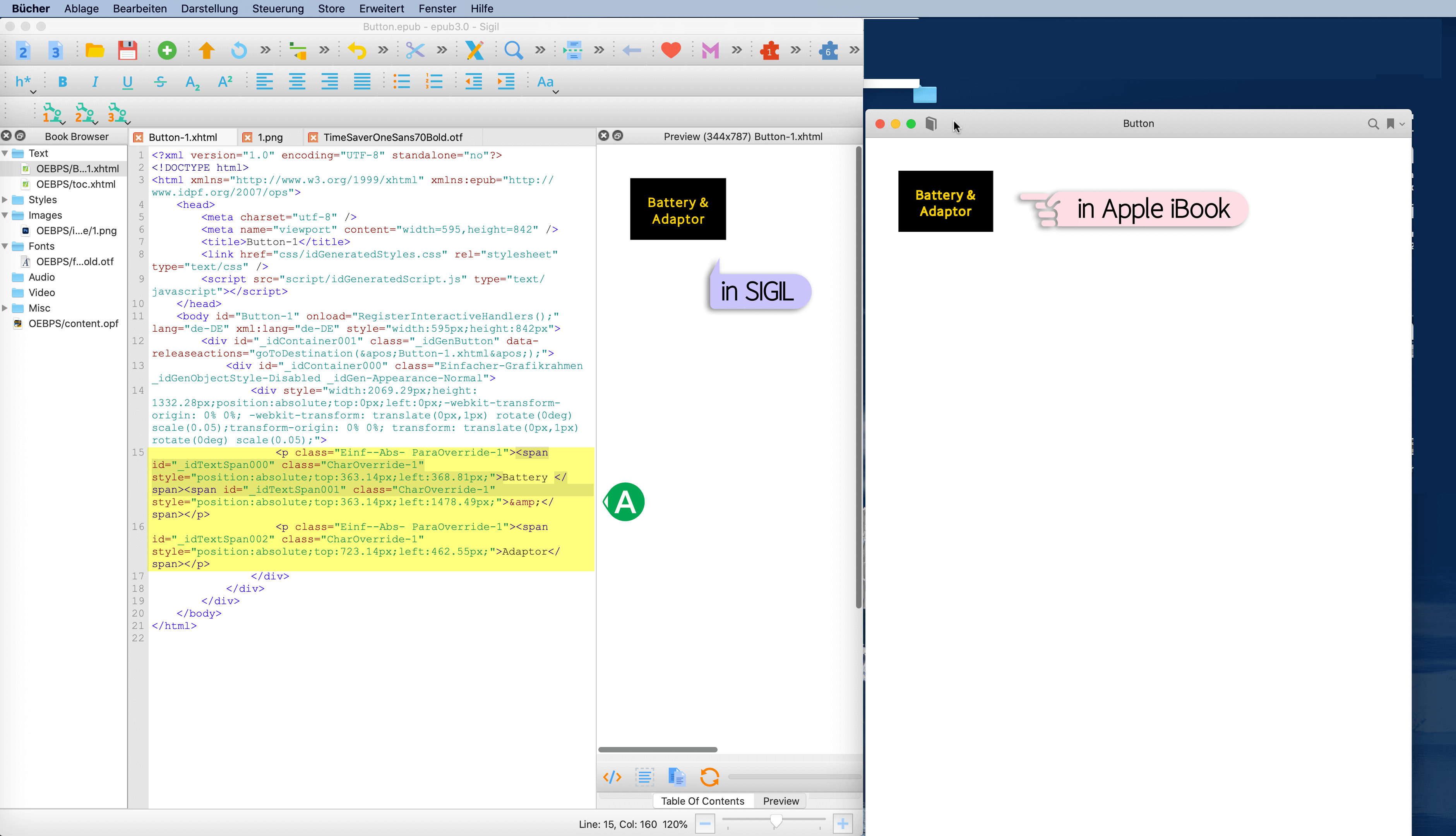
If I export the IND document as epub and then open it in SIGIL, you will see ( A ) the source code. The text “Battery” and “Adaptor” are defined by fixed positions with two decimal places in pixels on the button.
Now XHTML and CSS, which make up an ePub, is not a print like a PDF file. You will always have small deviations in the ePub because every (reader) programme interprets the XHTML/CSS instructions differently.
As a solution you can try to create the buttons with SVG-graphics or PNG-graphics. Then there should be no discrepancies.
Good luck,
– j.
MyButton.zip (545.3 KB)
Jens, thanks for your response. I’m aware of how InDesign fixed-layout epub export uses absolute positioning. The issue is not the width difference (I respaced when updating with the accented characters) but the baseline shift. Even if I bypass an epub reader completely by unzipping the epub and opening the XHTML in a browser this baseline shift is evident. So it’s not the epub reader that’s the problem. I don’t want to have to convert the buttons to SVG or PNG. I’d rather that it just works correctly without a workaround like that.
Anyway, I was just hoping this might be something you’ve seen before but I guess not. I’ll keep messing with it to see if I can figure something out. I will probably try importing spacing from the previous version and see what happens as a start. I’ll let you know what I come up with if anything.
Best wishes,
Steve
Ok.
Did you try me font in the zip-archive? For me, it looks correct with my font, isnt it?
Jens - Sorry, yes, it looks correct with your font. However, I’m not sure it’s a valid comparison since the font you provided is only a subset with limited glyphs rather than a full set with accented glyphs.
It just occurred to me that my problem might be where the ascender is set. Since the first version didn’t have accented glyphs, I set the ascender not much higher than the cap height, and I did not reset it for the added height of the accent glyphs. I sense that maybe I should have moved the ascender up to the top of the tallest accent, yes?
What do you think?
Hello,
you can try the complete font with 1260 glyphs and all glyphs for 40 european languages:
• https://www.computergrafik-know-how.de/free-font-timesaver/ (german explanation)
• http://www.computergrafik-know-how.de/wp-content/uploads/2021/09/A099-TimeSaver_Font_15_Styles.zip (download: 10 styles, PDF in DE and EN)
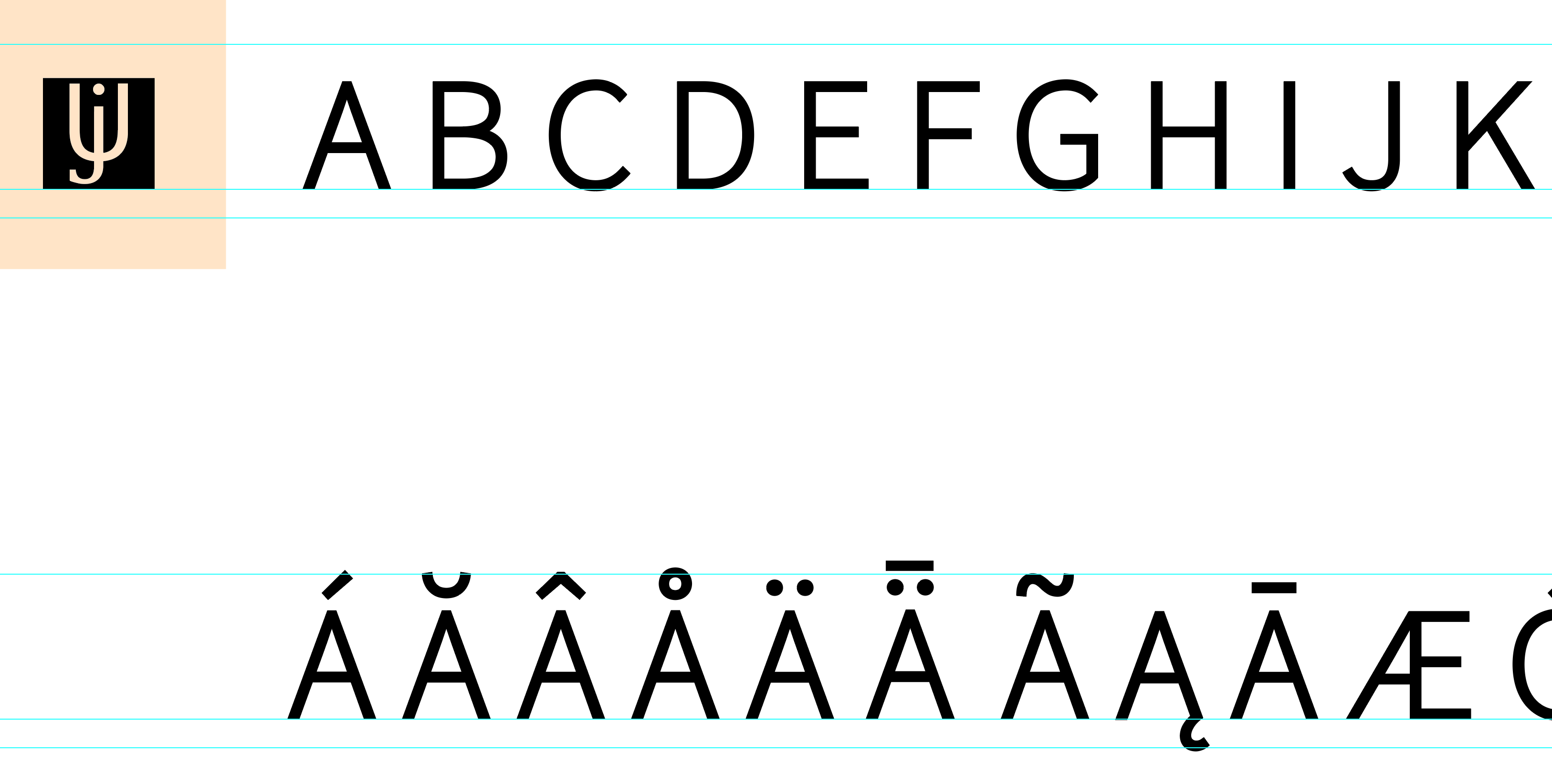
That’s what my guide lines look like:
The french Á and À should be below the ascender.
Good luck,
– j.
Thanks Jens. I will do some more tinkering. I’m leaving town for a bit so I’ll revive this when I return.
Best,
Steve
Jens, I had an opportunity to work on this some more before leaving. I corrected the ascender metric (guideline) and it appears to have fixed the problem! I set the ascender guideline to the top of the accent marks and reimported/replaced all the glyphs (with named guidelines selected) and voila!
Thanks for helping me think through this. 
1 Like
