Hi Maxp,
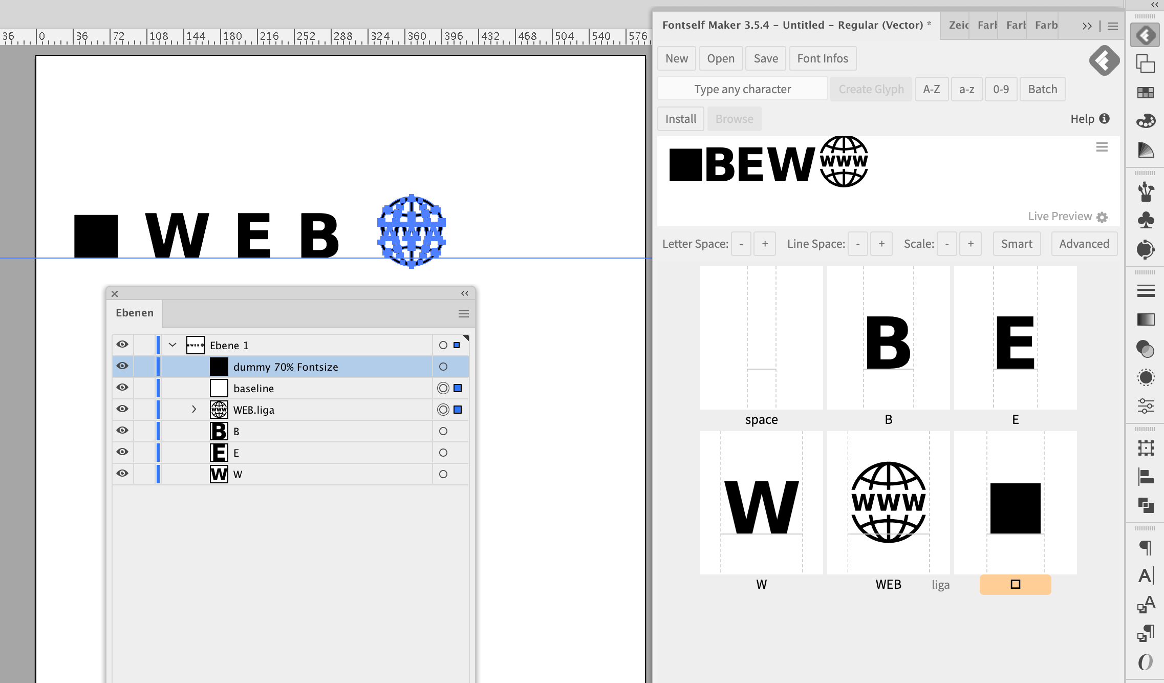
Sorry, if the example above - showing, a Square, W, B, E and Globe; if each object was to represent a different logo - then please ignore.
My response is merely clarification to what I think you are asking. You mentioned you need 50 Logos.
that is, to have 1 font, with 50 logos contained in that font you make.
The method I see from Jens - seems to express a build that uses a few keystrokes to set a logo.
Think of assigning one keystroke to each letter. When you run out of letters, assign the capital letters for the remaining logos. Example press “a” gives you the Apple logo, press “b” gives you the Acer logo, press “c” gives you the HP logo and so forth. Press “A” gives you IBM logo.
Each logo is rather complex, containing all graphic and lettering style as outlined.
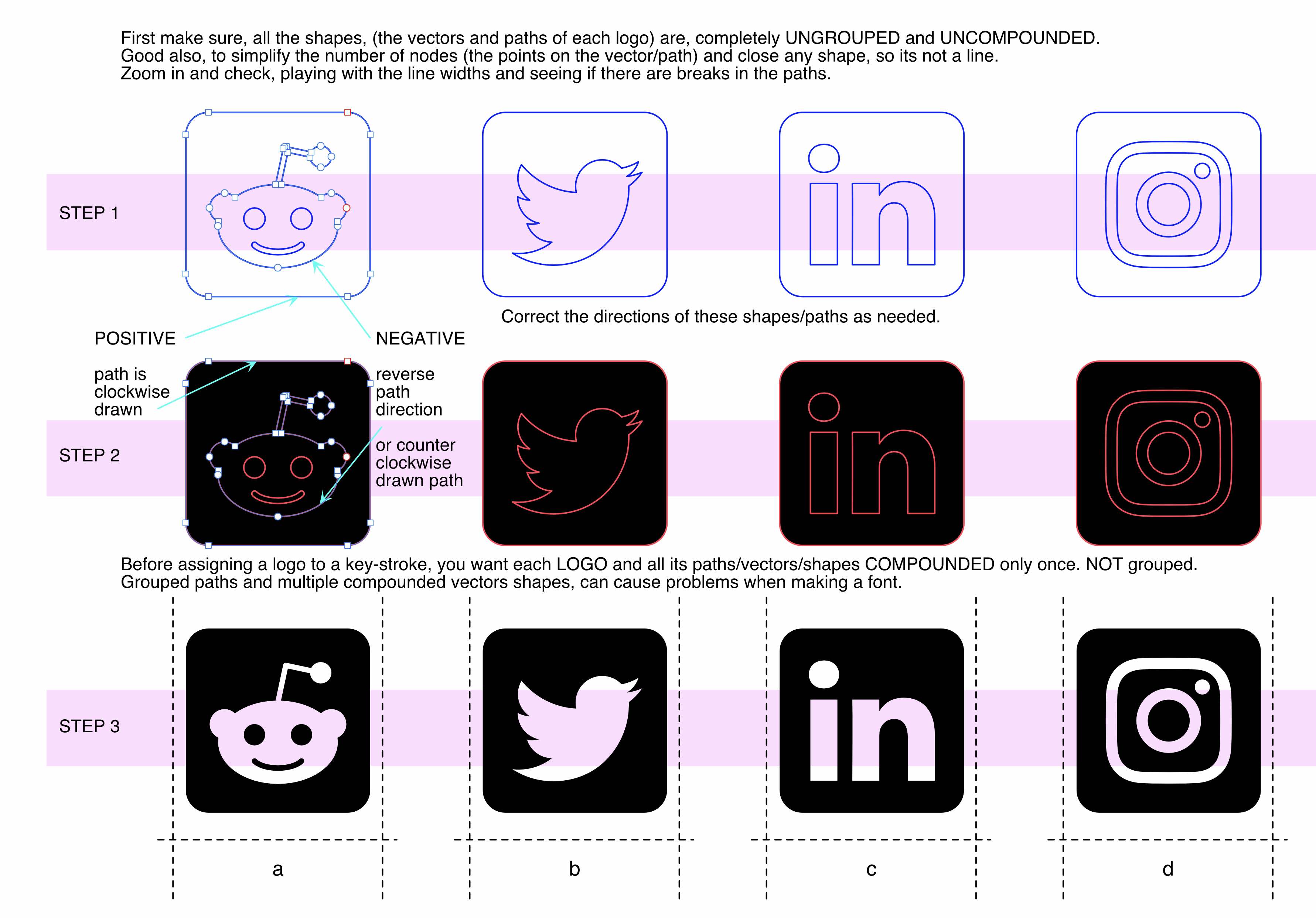
Make sure, that every vector shape required to form the logo, that first, that all shapes (paths / vectors), negative and positive shapes (or direction of drawn vector goes in a clockwise fashion) meaning… every vector shape is (ungrouped and uncompounded) before assigning the logo as a letter.
its a good idea to also, simplify the number of points (nodes to each shape - only if there appears to be far too many to a shape) In general, circle or oval can. might have 2 to 4 to 6 nodes to make its shape but to have 37 nodes is somewhat redundant and over kill. So simplify that… in Illustrator there is a Path function to reduce the number of nodes, called simplify. Adobe lets you see before and after - but please use with discretion. If you use the Simply feature too strongly, your shape will change too much.
Another, thing to do at this point, is to check if a shape (the vector paths) are closed. If a shape is not closed, it is a line not a shape. You can play with LINE thicknesses and ZOOM tool to look for a broken shape which is a line. There is a “close path” function, performed simply by touching the vector line and telling it to close. Doing this by hand can be hard and cause inaccuracies to the shape.
SO - once you have done a clean up as described above. On preview, It will look like a single black blob – a mess if, (in my attachment that would be step 2. Hence, you have un-done and cleaned things up as I have described. Form your Example: the WWW Globe seen above would appear all filled in black. We now, want to put things back visually as they were.
Select every vector/shape/path and only apply, one single compounding function to it. If the logo, does not look right, reverse the direction of shapes/vectors paths so the logo does view properly. (You might not have to do anything) - but just to be clear and helpful, for others. We want to make it sure, negative shapes (punched holes) appear properly (this means a path for the computer to be drawn counter-clockwise.) You do not need to physically re-draw a path yourself in that direction… merely make sure the setting of the vector path is going in the direction so the shapes know what is solid and what is clear (see through - a hole).This correction is easy, and performed with a single click in the path attributes. Just changing the direction the path goes so it views correctly. All this is part of cleaning up the Logo - so it is as simple and clear for a single letter of the keyboard.
When the Logo is clean, all paths of that LOGO (its vectors, the shapes) should only have ONE Compound on it. (JUST ONCE) no grouped shapes and no multiple compounding of the shapes. And it needs to look correct, so only correct the vector path directions as needed.
Once you get to this step, for every logo (you want 50 of them) then assigned each logo to a keystroke of your desire.
Though this was your question, and it seems you are moving forward well. This might help others.