Ok, now I get it.
For additional characters, I always check first if there is such a thing in UniCode. Then my character must get the corresponding UniCode. In the Romance languages, for example, we have the superscript a and o, for which there are separate UniCodes. See Superscript & Subscript Letters ᵃ ₐ ᴬ ᵇ ᴮ Copy and Paste on (◕‿◕) SYMBL
For my own ligatures, which I create with Fontself, I make sure that there is no unexpected transformation. Defining “th.liga” as a superscript “th” would be fatal, because the “th” also occurs in words like “the”.
Therefore, the idea of distinguishing it from the normal spelling with an additional character is good.
You have to consider what the user sees and reads when the text is written in Arial, for example. This happens quickly on the web or in e-books because you can change character sets there.
So in my font TimeSaver Two I used https://www.behance.net/gallery/129739259/Symbol-font-TimeSaver-Two-for-print-web-and-ebook (see graphic, there “Marker”) for a combination of brackets and colon or < and > for the markers. A “(<A)” (marker with arrowhead to the left) can thus be understood by the reader even without my font.
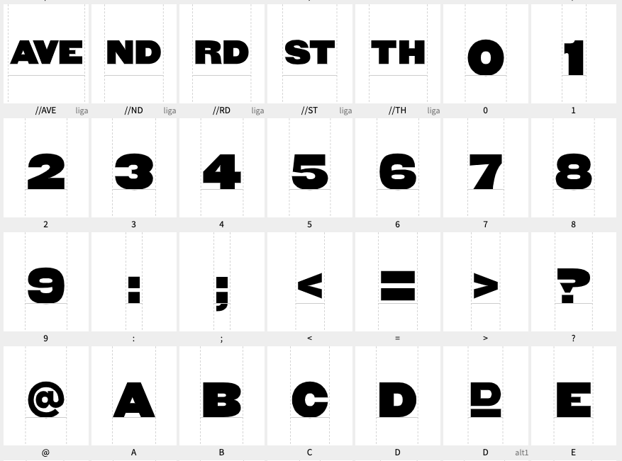
Such a character overview on an A4 page as a PDF should be included so that the user can quickly find .alt and .liga at a glance.
Unfortunately, Fontself does not allow you to define context-dependent symbols. A number followed by “th” could then automatically superscript the “th”.
Regarding your spelling: // is the symbol for comment and part of a URL in many programming languages. Therefore, this symbol has a fixed meaning for programmers. The symbol for superscript is “^” or the notation in brackets “(th)”.
Or you can create a ligature for each of the 10 digits: 1st, 2nd, 3rd, 4th, … 9th Then you have a completely natural notation and the user doesn’t have to know anything or look anything up, simply activate the ligatures; and without it, it is also clearly readable for everyone.
– j.