Hi,
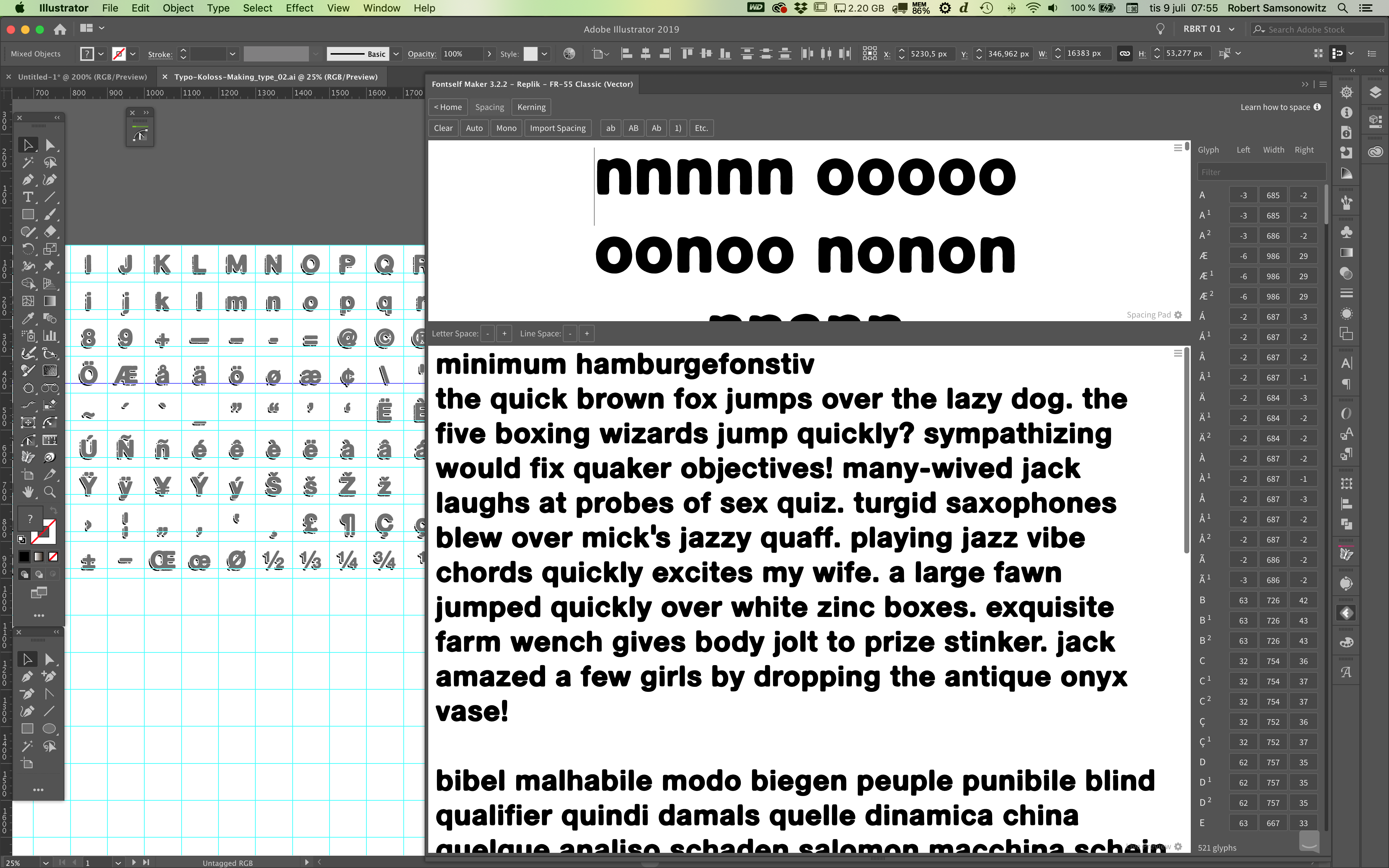
I’m working on a detailed font with lots of alternates. Every change I do to the metric in the alternates (I want the alternates to have the same metrics and spacing as the regular characters) the “refreshing font” takes like 5 or 10 seconds. The typeface has over 500 glyphs and it will drive me crazy and I will literally spend ages on just waiting.
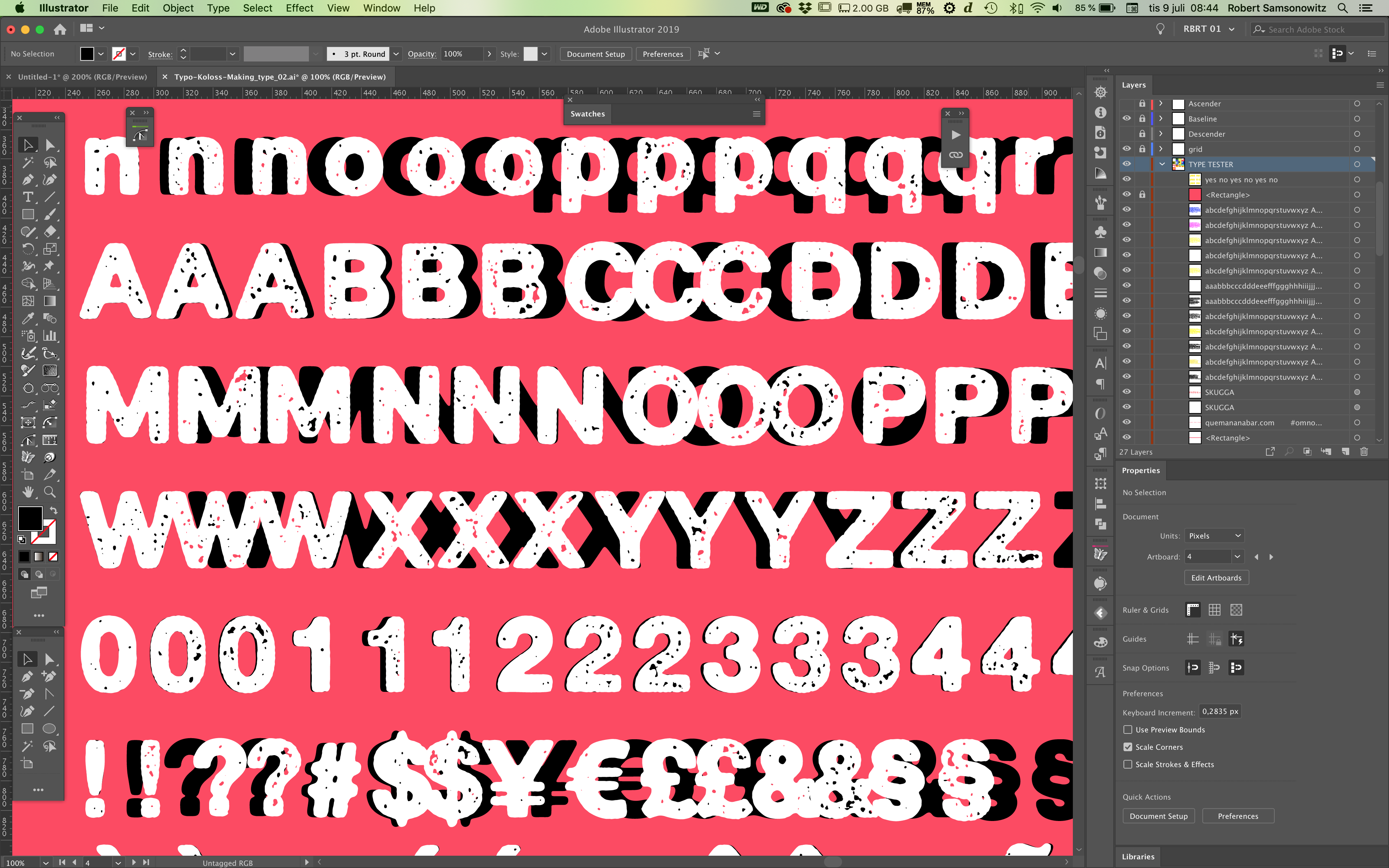
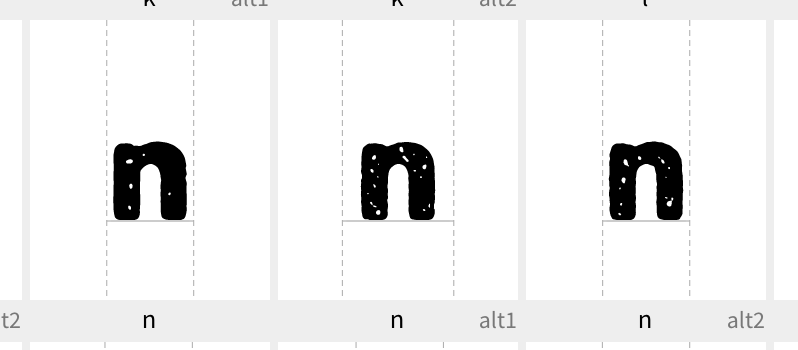
I have another version of the font which isn’t as detailed (a “cleaner” version – not as many anchor points), and I figured if I make the same alternate “cleaner” characters (but with the same basic shape/metrics) I could import the spacing to the detailed font. So I spent a good 5 or 6 hours in making alternates and making sure they all had the same metrics and also updated kerning groups etc. so it all would work out fine when importing to the detailed font.
Well, as it turned out that didn’t go so well. The imported metrics of the alternates are way off.
There are also still a couple issues when importing some kerning pairs into the textured font file, and we will investigate to see how this can be fixed in an upcoming update.
The goal would be that you should be able to import both the left & right-side spacing metrics along with the kerning to get a better match between both versions (with the extra benefit of not having to reedit the left & right side bearings in your textured font).
So please give us some more time to improve this and get back to you. Stay tuned…