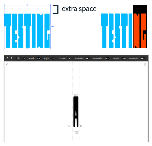
I’m having issues with some unwanted extra space above the characters when testing the font in Illustrator. As of now, I only have 26 characters (a-z) and a period all uppercase. The text frame is taller than I would like it to be and when I highlight the text, it highlights that extra space. It’s not a huge issue, but it makes the text rather annoying to work with and is throwing off the leading.
I’ve tried changing the character spacing, ascender, descender, baseline, cap height, etc. and I’m still having the same issue. I’ve included a screenshot of how I have the characters set up, maybe I did something wrong here. Any ideas on how to get rid of this unwanted space?
