Hi all, if anyone here has time to look at my new product I’d be much obliged.
Two pages are Fontself related:
I’d appreciate:
Any feedback on the site
Any feedback on the font. It’s mostly for the web site (and thus the weird sizing is okay) and has many issues when used in other applications. But I do want to share it.
It’s early software and it’s a solo passion project. No need to be gentle—feel free to tell me everything—but do understand that things are going to take time.
There’s also a form on all the beta pages where you can submit anonymously
To answer a common question: Has it been tested for accessibility? Answer: mostly.
Hello, I have looked at your website and I don’t understand some things.
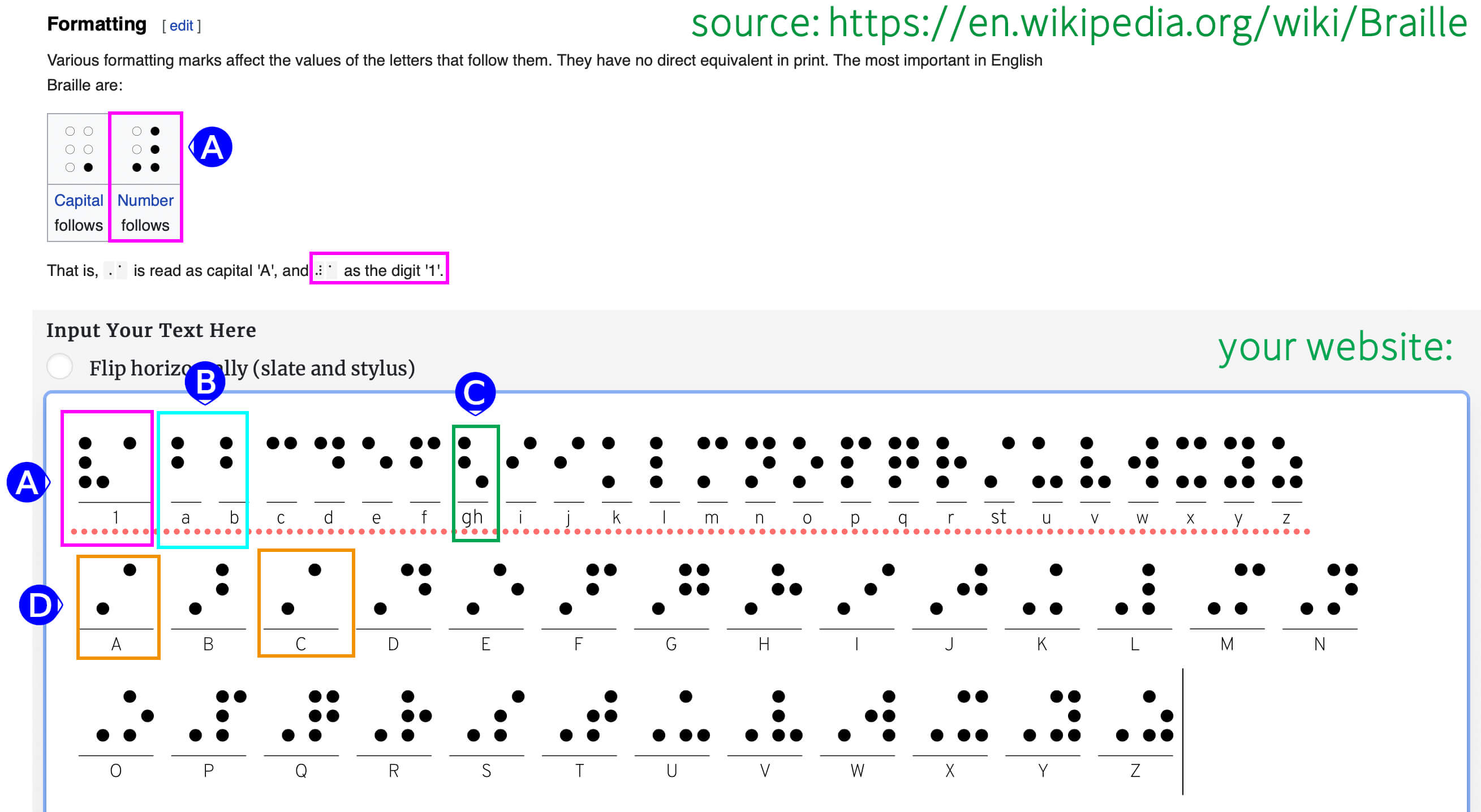
According to wikipedia ( Braille - Wikipedia ), braille signs always have the same width of 2 x 3 dots. In your case, the characters have different widths. I am also not sure if there are different characters for small or large letters. I had understood that a capital letter begins with a special character (dot at the bottom right), just as numbers begin with a special character (mirror-inverted “L”).
According to my understanding, all characters should have the same width (2 x 3). If you do not want to show the unfilled dots on the left side, then you will have a problem getting all glyphs to the same width in Fontself. I only managed this with a hack
Regarding the braille width - what page are you reacting to with that comment (there’s a lot of content)?
Braille cells are always arrangements of 2x3 dots. Hopefully the Introduction to Braille page is clear, take a look at that if you have a moment. It also describes capitals and numbers.
In terms of blank space at the left of a cell, for my font, I hacked that problem with the horizontal line dividing braille and print. See that here: Write in Braille
That’s the only custom font I use on the site, the rest is static graphics which are easier to control, and display alt text for.
Re item C: “gh” is an example of a contraction. Find the “G Contractions” section on the intro page and that will show that. Every other contraction on that page is a separate ligature glyph; most of the font is that content. Another example, “knowledge” which is just a “k”, needs to be a whole glyph, because the lig needs to see k-n-o-w-l-e-d-g-e together to turn into the glyph.
All others are legitimate errors, thanks. I was so focused on getting the contractions to work that I appear to have missed the basics. Now, for some reason, I have a corrupt ai file now. Looks like I need to rebuild the whole thing. I can’t believe it.
This is partly why I want to hand code the fonts. All the thing you found would be simple fixes–I’d be removing a circle shape from.
There is other font software I should perhaps consider for that purpose. But the braille art is so simple, that I really think I’ll end up with some new software for the specific purpose. Hence my desire to understand the otf file structure.
Well, I do have versions as I keep all my ai and otf files hosted on github in addition to local. But even previously working versions are showing up as corrupt. So it’s possibly some larger problem.