Hi, I’m not writing to trash FontSelf but I have a very specific purpose in mind for a mini project, and I’m wondering if there’s a better way to do it rather than use FontSelf to recreate an existing font just to edit spacing. I’m looking for advice - other tools, perhaps a code-only way to do what I’m trying to do.
My goals, in order of priority:
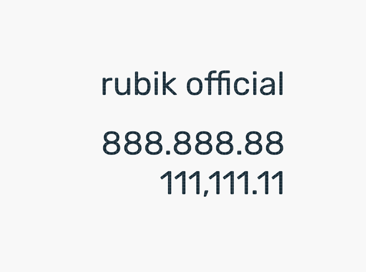
get Rubik’s numbers to line up in a right-aligned table column in a web without using css hacks that don’t work cross-browser. 1,111,111.11 and 8,888,888.88 should have numbers that align. Right now, those 1s are narrower proportional glyphs, so they don’t align.
The comma and period do not need to be a full space, so I don’t need a monospace version. But I’d settle for a monospace version, and I’ve done a proof of concept of that in FontSelf. So I know I can create either monospace or lining-numbers version.
I really don’t want to host this font, and I’d rather have it come from Google’s CDN. I am expecting some weirdness when switching between the Google Fonts Rubik and my Rubik frankenstein monster. Rubik is an open source font that should theoretically allow me to extend the catalog with the new monospace or lining version.
I don’t really need to touch any glyphs, and I would rather edit the spacing only. Is there a way for me to edit the woffs or base files from their base files? Or another program better suited to this task?
If I need to recreate in FontSelf, is there any good way to try and match up to an existing font in the wild? Is there any way to “open” an existing font so you’re re-creating its glyphs (in which case I’d only edit the spacing on the “1”?
Obviously, this is potentially off topic, so if you want to point me to other forums, that’d be great.
I understand your frustration - I have experienced this myself with web fonts not aligning properly - not following tabs and page structures for numbers. And although I do not have an answer for you - I hope someone does – it would be great to see - such details on many other fonts - available on Google that can align properly - or as most would expect. The example you show is painful - 888,888.00 should have a comma at the first one thousand location - and the program where the font is being used… should also understand alignment at the decimal location too — but the font also needs to be spaced in a way that would require zero alteration - kerning - or tracking.
The fastest solution without creating any font at all - would be to assure the document or layout with your numbers follow rules for alignment at the decimal point – then track the “1” s ever so lightly.
Thanks, that screenshot is from Sketch App - a great program for UI designers, not as much typographers or visual designers. There are four ways to align text (left, center, right, and justify) so obviously it’s pretty limited. In this case I’m just using it to show the layout challenges. Even with my comma/period goof it would right align everything.
In the app I’m working on we’ll definitely aim to make sure decimals (and other symbols) align. That’s really the point of this exercise and I hope I can find something that works without reinventing the wheel.
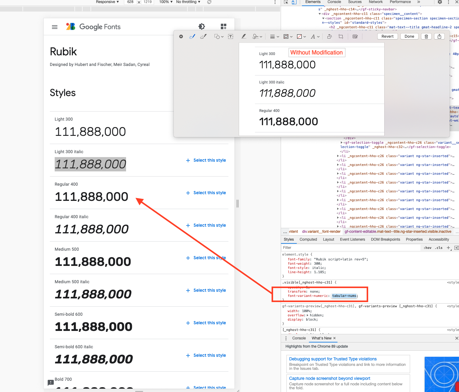
To add some complexity to this challenge, there is a css attribute that would work great for this purpose. However, it doesn’t work in internet explorer (which we know some of our users are required to use).
This screenshot shows me modifying the Google Fonts speciment with this attribute, and suddenly there are lining numbers (notice the 1 glyph which has a slab serif now).
So now I’m wondering if there’s some way to specify this font without using the font-variant attribute - perhaps we can swap in the right glyphs some other way. I’ll ask my devs.
Or it will just suck for IE users, or we deliver a different font for them.
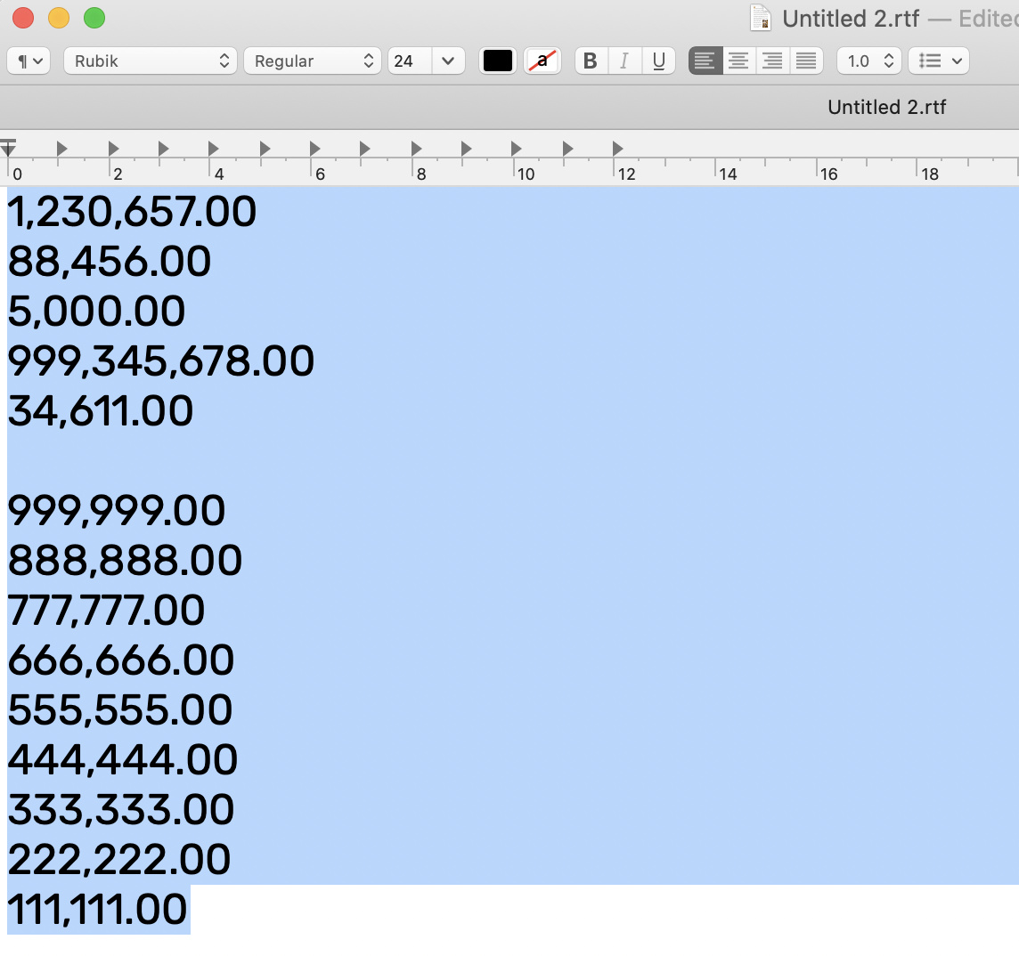
Actually the screen capture was from Affinity Designer. It was not meant to be the app for any solution. Merely done to check the font itself, and realizing that for most the numerals do flow under one another fairly well. For me, it seems only the "1"s are messed up. Now you could use fontself to fix this, by only adjusting the kerning of the 1’s - but then the official font form Google would not be used as you wish. You would need to include that font as a webfont displaying on the site you are making.
Would you be setting these numbers - or would they be numbers entered in by a user on a website?
Right alignment for web design is typical.
Either find a font that works already - or adjust one and post it with your site - otherwise…
I would again suggest looking into “Kerning” those 1’s with some HTML coding.
Yet that is a real hassle too.
There also is a way in HTML as in a WORD document to force alignment at the decimal point.
I had suggested to look into that also.
Now - would these code tricks show equally across different browsers?
I figure not.
Other than that… I honestly have no solution for you.
You mentioned - you hoped there was some sort of code to fix this - so I included reference to Stackoverflow and HTML specific topics on Kerning and Decimal places.
I hope this will lead you to some solution that is easy and fix your issues.
You are creating an app - I assume an online application - by which you are hopeful Old Internet Explorer users will be able to see and use also.
Aligning of almost any text font set (ONLY) to the left or right will not align well unless a forces tab or decimal point is used.
I am not a programmer - yet I would think best solution would be to display your text string $ into individual single containers to align every thing well.
,,.
Placing the numbers into containers centred on specific grid.
Or perhaps use a frame or gird where each letter is centred for the same purpose.
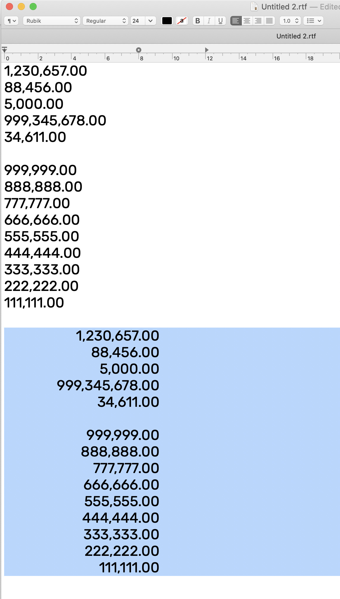
Apple Text Edit – setting text flush left and no set tabs
Setting with a forced decimal tab - something that can be done in HTML
however I see in Apple Text Edit the 7’s also mess things up too… where in Affinity Designer the right alignment with forced decimal showed me only the 1’s had an issue.
So is it the applications we use that see or access the kerning factors - TextEdit would not need or dream of kerning text properly - so I imagine it lacks any feature as such – hence not read the KERNING factors in the font.
Thanks for all the help Warren. Just to clarify an earlier communication blunder of mine: I meant my screenshot was from the Sketch app, not your screenshot that you mentioned is from Affinity designer.
You’ve given me lot of potential ideas, I’ll let you know what my engineers think. As I’m a bit of an amateur font hacker, I think I need to learn a bit more about how fonts are delivered to have an intelligent conversation.
I mean font hacker as in I want to do specific functional things with fonts, with not much interest in making beautiful new type faces. Eg, in this case I want to hack Rubik so it has an actual variant such as mono. In another case, I am using repurposing ligatures to simulate how braille contractions work. In that case, I really don’t want to design a “print” (eg visual roman alphabet) typeface and really want to incorporate someone else’s work. I won’t bog you with details on that, but as I move forward in the.
In my former life I was a book designer and had my typographic chops. I’ve gotten rusty a bit and the industry and tech has changed a tad.
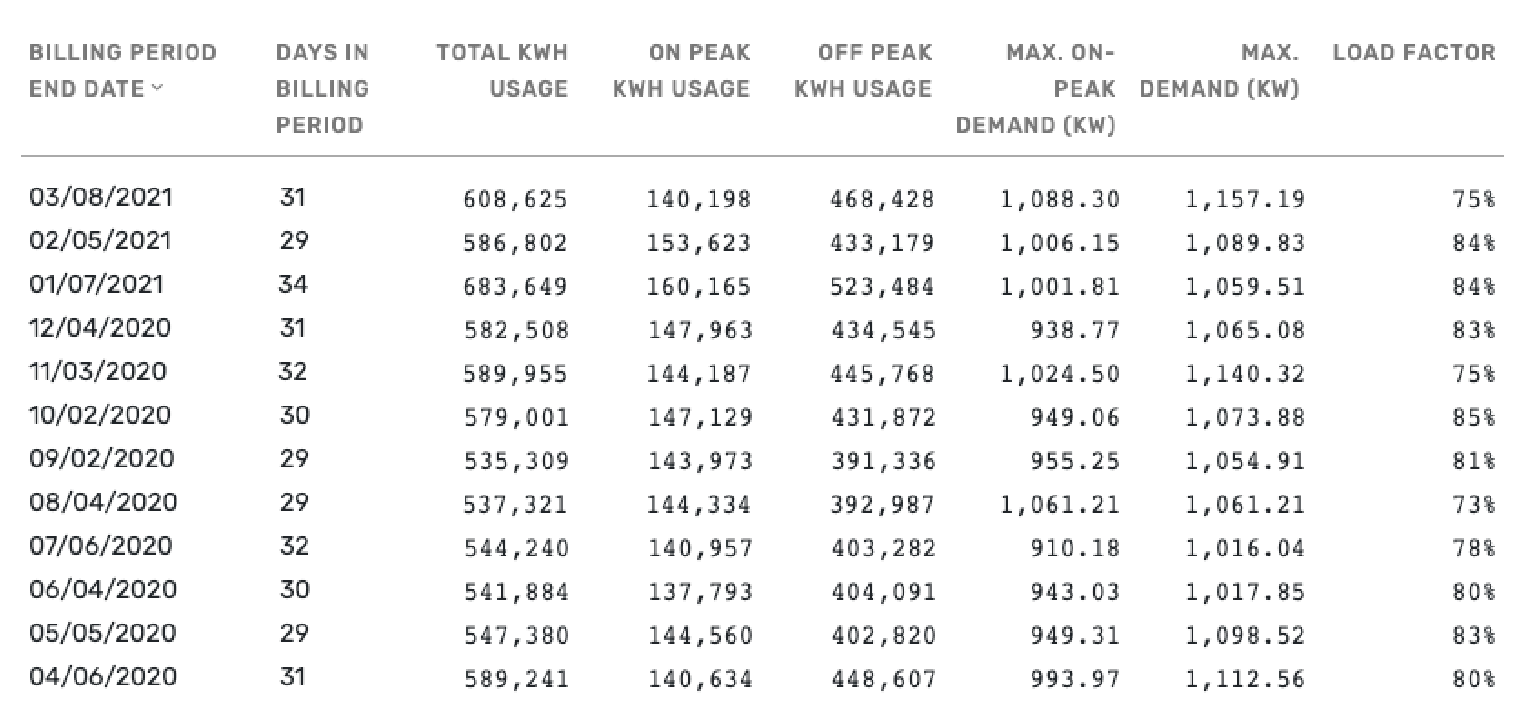
And just to close the circle until I report back, here’s the bad table that lead to this lining numbers/monospace pursuit of mine. It’s got a lot of different type styling happening as well as unnecessary semi-perceptible color cues. This is probably the worst of the worst of the platform I’m hoping to clean up. As you may intuit, the developer this must have gotten frustrated with Rubik’s non-lining numbers and just specced “font-family: monospace”.
There’s an elegant solution, but I’m trying to think through all the potential ones. Thanks again for your help, I’ll report back on this thread with more.
Hey no worries about Sketch. As I read through this Mar 11 reply and appreciated learning your background - monospacing kept coming to mind. That in deed should solve things for you - by setting the space around each letter to exactly the same throughout the font. “re-engineering or hack” the version of the font you need - by resetting (remove all kerning factors) set each number / letter, in the centre of the exact same character width across the board. Then export the OTF from Fontself, with your custom name. Afterwards, “if on a Mac” drop the monospaced font you just made onto FontPlop to make a webfont, specific for your site. FontPlop will produce old and newer web fonts, that I believe would be supported on the different browsers. (you would be required to have all fonts uploaded on your server for the right one to be used by the certain browser.) GitHub - matthewgonzalez/fontplop: Fast, Simple, & Free Open Source Webfont Converter
I really hope some of this helps you. I recall working on a project, that was many charts online and having an alignment problem too - back then I failed to ask anyone - a issue for me that no one seemed to care about.