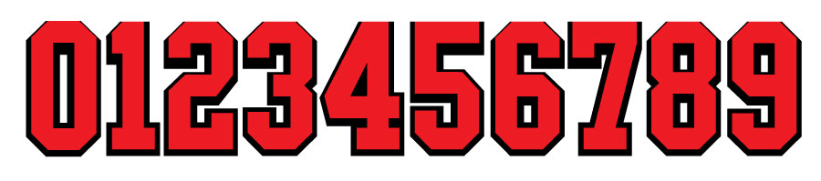
The red font is my original font made with FontSelf.
The black font is to be used as a ‘border’ to be place behind the original font to look as if the font is stroked. The web-to-print system we’re using doesn’t support strokes on fonts at this time so we have to do it this way.
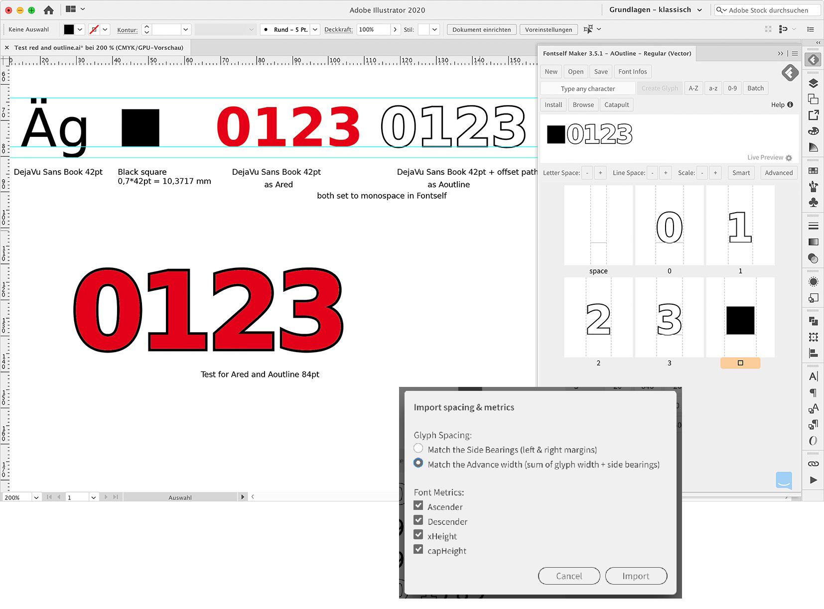
Anyway I made the first font by selecting the paths along with the guides and clicking the 0-9 button. I made no changes whatsoever at this point except for naming the font and saving it out.
Then I did an offset path of 1pt on the glyphs, and imported them along with the guides by clicking the 0-9 button.
This time I clicked the ‘Advanced’ button, then imported the spacing using my original (red) font. For Glyph Spacing I chose to match the Advanced width+sidebearings, and I left all four Font Metrics boxes checked.
When I load both fonts in Illustrator. The spacing itself works fine, but for some reason the height of the new font (black) is squished. At least I think that’s what’s happening.
I’ve tried different combinations of options when importing (match Sidebearings doesn’t give correct spacing or height, and Font Metrics doesn’t seem to have any effect either).
Does anyone have any idea why this is happening?
I did this once previously and it worked, but I don’t remember what other steps, if any, I took to make this work correctly.
I didn’t know about the 70% square, so I looked that up and followed your instructions, set them both to monospace and it came out pretty darn close.
The only thing now is you can see in my screenshot that the outer numbers appear to be a bit off for some reason. Do you have any idea why this is happening? If not for that it would be dead on.
I tested it in my example and couldn’t find your problem. Like you, I first created the red character set, then the outline. I imported the sizes from the red one. Within Adobe Illustrator CC 2020 Mac, the two character sets fit exactly one above the other at 84 pt and 36 pt.
Thanks a million @johnww This will be a good bit reading in the morning over a coffee. Cheers mate.
From my first initial read it definitely seems like it would be useful to include in the template.
For the records, after exchanging with @johnww we found out that the issue was that the scale of both font versions didn’t match.
This happens because the first time a new font is created, all glyphs will be automatically sized to fit into the font - whatever their original size in Illustrator.
To ensure all font versions match perfectly in size, once you have created the first font (or just opened it), press New > Style to ensure the second font has the exact same scaling (it will create a new empty font that will import Illustrator shapes as it did in the previous font style). And then just add the glyphs of this new version, as detailed here: Font families | Fontself Maker Help Center