Hello fontself team. There ara distortions when transferring the font I designed. How can I solve this?
Hello savassenoglu.
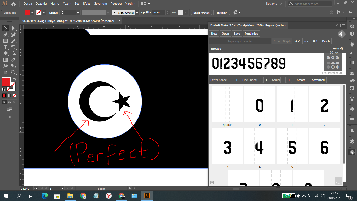
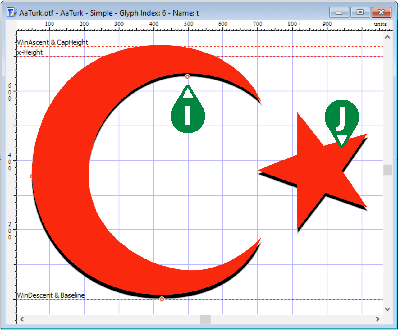
I have reproduced your font with two characters in Illustrator:
A. A square with 70 % of the font size, i.e. 0.7 * 120 pt.
B. The baseline is drawn (auxiliary line).
C. The letter T (from the font DejaVu Sans Book, 120 pt).
D. Star and moon drawn from the Turkish flag. I have placed this glyph on the “t” key.
You will find the four elements in Layers (far right) and in Fontself Maker.
There I gave the font the name “AaTurk” so that I can see it at the top of my font list.
E. I selected the new font “AaTurk”, 120 pt and wrote the letters “T” and “t” in red. I have shifted the text a little. Moon and star fit exactly on top of each other.
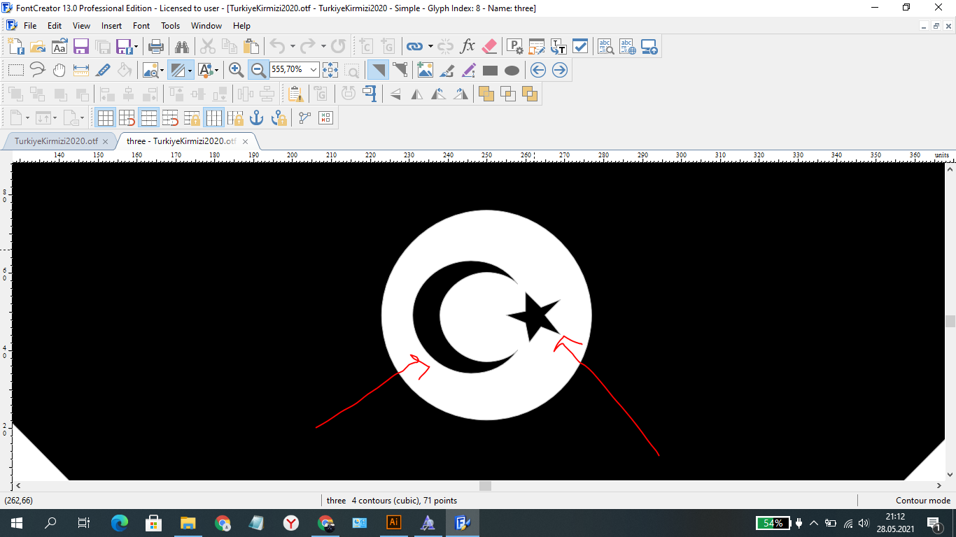
I then downloaded the demo version of FontCreator 13 and opened the font “AaTurk” in FontCreator.
F. Are all glyphs in my font.
G. Is the glyph “t”.
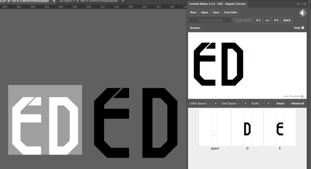
In Photoshop I then opened two screenshots from Illustrator and FontCreator.
I. The black is the representation from FontCreator.
J. The red is the illustration of the text from Illustrator.
Result: No distortion is visible.
Enclosed you will find my font “AaTurk” to test for yourself.
AaTurk.otf (2.4 KB)
Good luck, Jens.
1 Like
Thank you so much. This is the first time I am getting such an error. I will solve my problem thanks to you. ![]()
Would it be better if people are attaching their fonts to the request instead of Jens having to replicate their outlines? Or attach the AI files for that matter?
1 Like
Hello, I fixed the problem. I created my font with no problems. Thanks.
1 Like
Mi Estimado que tamaño de Alto usas para crear Números Deportivos, y más letras De A a Z que medidas son exactamente para que no salga distorsionado a la hora de escribir ya exportado el Font.
Tuve problemas con Real Madrid 2021-22 como trae lineas delgadas me salió mal, es decir las lineas una más gruesa que el otro.
> My dear, what size of height do you use to create sports numbers, and more letters from A to Z, what are the exact measurements so that it does not come out distorted when writing the exported Font.
> I had problems with Real Madrid 2021-22 as it brings thin lines came out wrong, ie the lines one thicker than the other.
Hola,
por favor, muéstrenos en una imagen cuál es exactamente su problema. Sin una foto no podemos ayudarte.
Hello,
Please show us a picture of what exactly your problem is. Without a picture we can’t help you.
[quote=“urs7000, post:7, topic:2910, full:true”]
> My dear, what size of height do you use to create sports numbers, and more letters from A to Z, what are the exact measurements so that it does not come out distorted when writing the exported Font.
> I had problems with Real Madrid 2021-22 as it brings thin lines came out wrong, ie the lines one thicker than the other.
Hola,
por favor, muéstrenos en una imagen cuál es exactamente su problema. Sin una foto no podemos ayudarte.
Hello,
Please show us a picture of what exactly your problem is. Without a picture we can’t help you.
[/quote]
MI CONSULTA ES QUE MEDIDA EXACTAMENTE DEBO DE PONER PARA HACER ESAS TIPOGRAFIAS DEPORTIVAS. ANTERIORMENTE PUSE 5CM Y ME SALIO MAL.
Lo siento, no entiendo el problema. ¿Qué has puesto a 5 cm? ¿El tamaño de la letra, la anchura de una barra en una carta?
Por favor, describa su problema con más detalle y/o destáquelo en el gráfico.
Gracias.
I’m sorry, I don’t understand the problem. What did you set to 5 cm? The font size, the width of a bar in a letter?
Please describe your problem in more detail and/or highlight it in the graphic.
Thank you.
1 Like
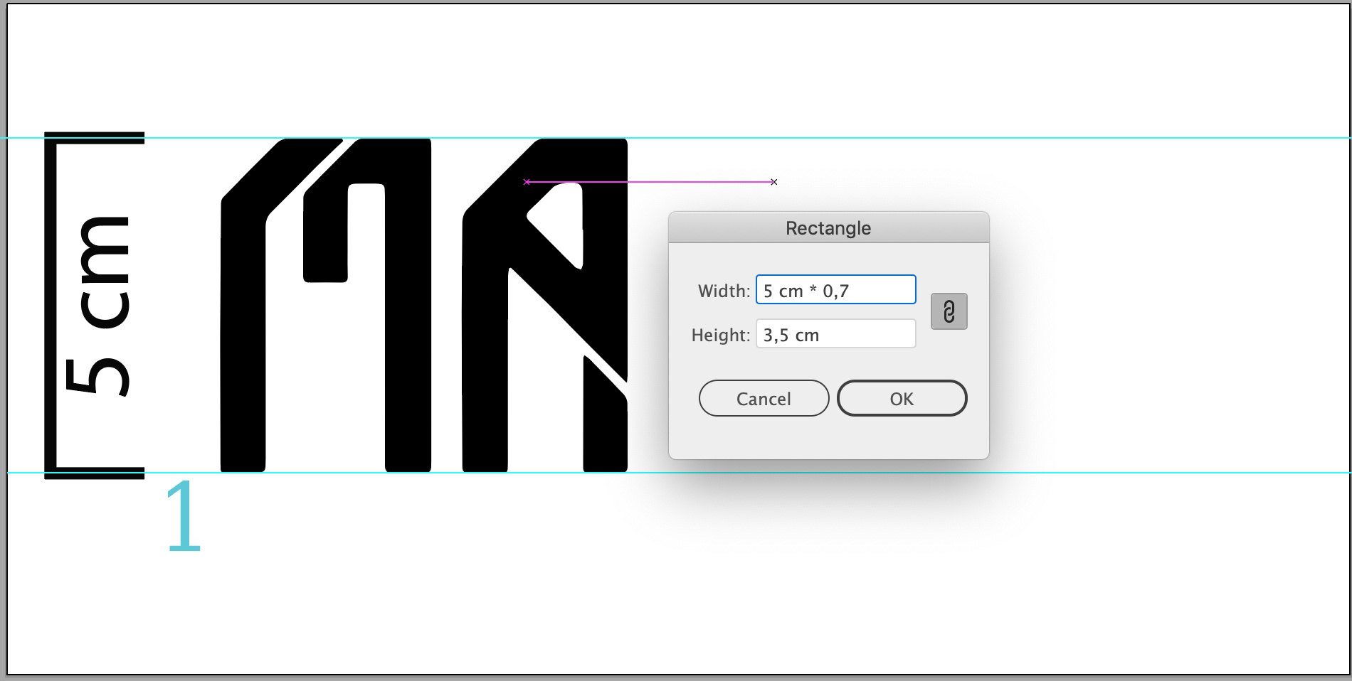
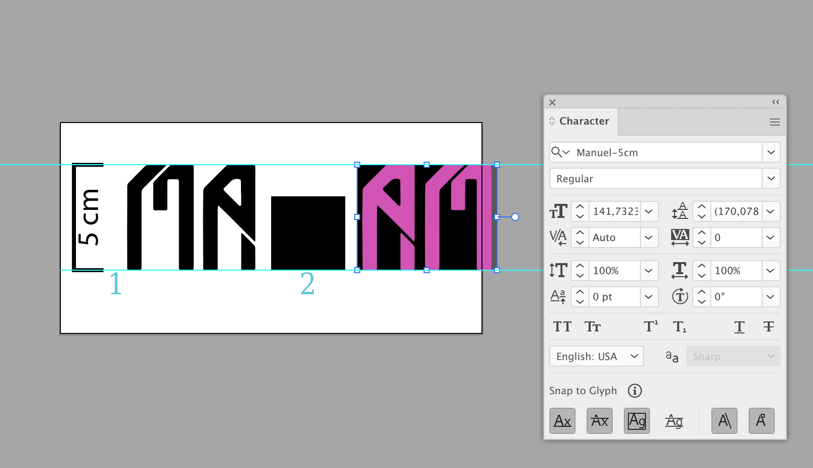
Lo que preguntaba es, cuántos puntos o centímetros debo de poner de alto cada letra y cada número para que la tipografía sea perfecta. Yo siempre puse 5cm de alto y me sale distorsionados.
No me queda claro a qué te refieres con “distorsionar”. Si su nueva fuente no tiene la altura esperada, entonces necesita calibrar Fontself con un cuadrado negro.
Normalmente medimos las fuentes en pt (puntos) y no en centímetros (cm), pero no importa.
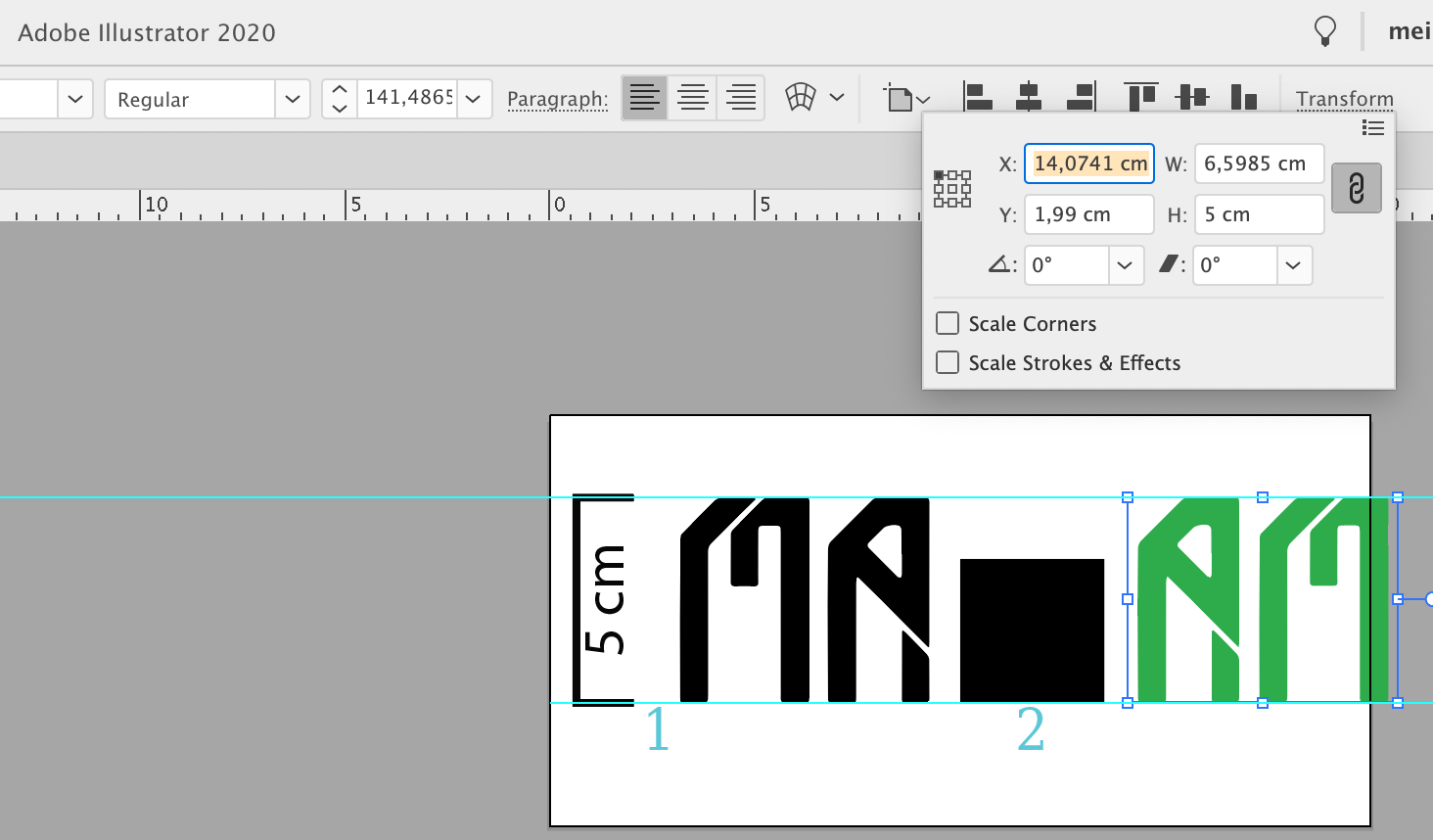
Una fuente que debería tener 100 pt de altura necesita como primer objeto en. El tipo de letra es un cuadrado con una altura del 70 % de 100 pt, es decir, 0,7 x 100 pt = 70 pt. Con sus centímetros 5 cm * 0,7 = 3,5 cm.
En mi archivo de Illustrator se ve el cuadrado y dos letras, que tienen 5 cm de altura como caminos. Después de crear la fuente, puedo escribirlas en Illustrator y seleccionar 5 cm como tamaño de la fuente. Funciona ![]()
Archivos adjuntos, las capturas de pantalla se pueden ver aquí.
Traducción realizada con la versión gratuita del traductor DeepL Translate: The world's most accurate translator
Archiv.zip (1.1 MB)
I am not sure what you mean by “distorted”. If your new font is not the expected height, then you need to calibrate Fontself with a black square.
Usually we measure fonts in pt (points) and not in centimetres (cm), but never mind.
A font that should be 100 pt high needs as first object in. Fontself a square with a height of 70 % of 100 pt, i.e. 0.7 x 100 pt = 70 pt. With your centimetres 5 cm * 0,7 = 3,5 cm.
In my Illustrator file you see the square and two letters that are 5 cm high as paths. After creating the font, I can type them into Illustrator and select 5 cm as the font size. Works ![]()
sigo teniendo ese problema cuando escribo la tipografía el recuadro plomo que vez, esta bien de la base pero en la parte superior pasa de la letra. a que se debe eso? cuando escribo debe de ser igual cierto.
Como he escrito arriba, necesitas el cuadrado con la altura del 70% de 5 cm = 3,25 cm. Arriba también puedes encontrar mi documento de Illustrator donde hago exactamente eso.
Me puede enviar un video explicando por favor gracias.
