Hi guys,
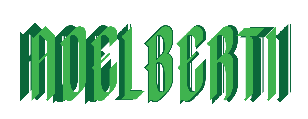
I’m creating a blackletter typeface and have created a 2nd one witch is bolder. I want the spacing an kerning the same so they can be placed on top of each other. The user can color them both different and have full control. (see image)
After lots of trying and testing I can’t seem to get it right.
I copied the settings of the first font into the bolder version but because the 2nd one is bolder they do not align.
Using the + or - letter space buttons with the same settings as first font is not the way.
By hand is undoable. Is there a way to do this right?
Maybe the same settings minus x, I don’t know.
Thanks,
Yes I know. i created the 2nd font that way.
But the whole point is that I want the end user to have full control over colouring different elements of the font like in the screenshot.
Ok I understand more clearly now your objective.
Personally, I think you may have to produce subset fonts, or a group of fonts to make up a typeface family such as different weights (regular, bold etc) and in doing so have the offset spacings different in order to achieve the desired effect/result.
I’m still quite new to Fontself, but it’s worth to explore OTF options
@Thom Thanks Thom, I really hope you find the technical solution you are looking for. Please keep me posted & informed as I’d love to see this one fly! With recolouring fonts, the closest solution I know of is having a typeface (font set) with different colour options – supplied in an .OTF format. Recolouring fonts straight off is not an option available in any softwares, other that a design application such as Illustrator where you can manually do this.
Yes @Strobia, colouring in 2 or more tones can only be done by converting the type into line. InDesign and Illustrator can do gradients with live type and create outlines. But that’s not what I’m aiming for for the end user. Probably logo designers convert their type into outlines and can place the individual letter on top of each other. I’ll keep this post updated with news.
Thanks,
Thom