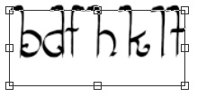
I’ve been having lots of fun using Fontself to create new fonts, but just came across an issue and I am not sure what setting/tool should be used to fix it. I am creating a skinny/tall font and find my taller letters like “F” and “T” are being cropped at the top when I am testing the font in Illustrator. How can I fix this, if there is a way without me having to resize the letters and batch import them in again? I really love the scale of the font and am hoping something else can be tweaked. Thanks in advance!
I was having similar issues with ascenders or descenders getting cut off, particularly in Microsoft Word. On screen it would appear cut off, but it actually printed out just fine. I was able to fix these on the new Fontself update. I reopened the OTF, then raised the ascender line. I also went further and adjusted the line heights.
I really appreciate the tips and will be working on the font this weekend and will try some of these things.
Mikkomix, it is weird because I found the same thing - printing or exporting images with the words comes out looking great. No cut off other than on screen, so odd…but I know it is important to fix this issue before I finalize and try to sell my new creation.
Hi Joel, I am creating my fonts in photoshop cc 2019. I also see the tall letters (like t) are cut off when I type the rendered fonts in photoshop. I went back and pushed the ascender value up further than it needs to be; but this did not help. I went back checked the free transform box (CTRL-T) for the tall fonts on the working layer and there is no extra space around the letter. But when I type the rendered fonts in photoshop and apply the transform box (CTRL-T) there is dead space beneath the font baseline.
Hi, we just shipped a new beta version (3.2.0) that helps identify and fix such potential issues, which can be due to glyph size and/or the ascender height.
In theory
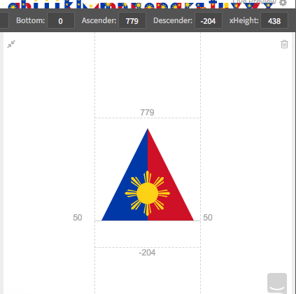
Usually, your tallest glyphs should not be higher than 700-800 units, as all glyphs in your font should fit roughly within a 1000-units bounding box in total (from the tallest glyph, like Â, to the lowest descending one, like g).
If your glyphs are much larger, they are at risk of being cropped, but as all apps do not clip text the same way as they do not share the same text rendering rules. They might show up ok in Illustrator but not in Word (and this may vary based on the versions of Word…).
Browsers and operating systems also differ in how they clip text. (Yep, welcome to the complex art of type-making)
The factor to balance is the position of your Ascender, which is usually slightly over your capitals and which will define the top of each line of text…
… at least in theory, as all apps may not use the Ascender value to position your text. Behaviors may vary from app to app, even within Adobe’s various apps… (We can hear your sigh)
In practise
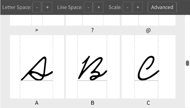
The first thing to do is to ensure your glyphs are not too large compared to other fonts (their capitals are usually around 700 high). The new beta now shows a sample font below your glyphs when you roll over the Scale buttons:
Beware that if your uppercase and lowercase letters have very different heights, you should adjust the overall size of your glyphs based on the largest ones.
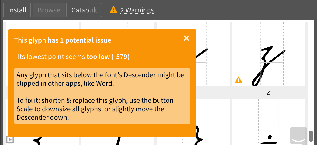
If you go way beyond limits, you can check actionable warnings that detail the issue and suggest potential fixes: