Hello!
I’m still kinda new to Fontself and I ran into som issues with kerning my cursive font. I can’t find much information about this and I wonder if someone have any suggestions.
I work in windows 10 and illustrator if that makes any difference.
I’ve used an already existing font and done some tweeks for it to match what I need it to do.
When I’m done with my OTF-file I’m gonna turn the glyphs into an PXF-emobroderyfont (that’s why I used an old font) I thought that by using and old font and not touching the connecting parts I wouldn’t need to do more spacing and kerning than downsize the spacing and the glyphs would match. Or import the spacing and kerning from the OTF-file. But since it’s not created in fontself I can’t import all the values. Long story short, is there any way to space and kern without me needing to manually write every single letter combination down that exist in both upper- and lowercases and adapt it along the way? For example the lowercase L connects fine when I write Molly, but when I write Melwin it doesn’t, when I write Mila its fine, when I write Millie it’s not.
It’s a long shot, but worth a try!
Thank you!
//Sanna
1 Like
Hello Sanna,
there is the “Smart Space & Kern” in Fontself that can save you a lot of work.
( A ) Click on “Smart” in Fontself.
( B ) Then you can specify the maximum space.
( C ) Click on “Smart Space & Kern” to start the process.
Done.
( D ) In “Advanced” …
( E ) you will find the “Smart” button again.
If you have further questions, let me know.
– j.
Thank you for your reply!
Yes, I’ve used the smart spacing and kerning, wich is fantastic and saved me tremendeous amount of time, it works great in block script. But when I use it on my cursive font it fixes, I would say about 75%, of what’s needed to have smooth connections.
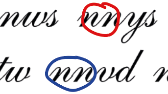
And If I only look at the text written in the Kerning pad, it looks like this
n + n works in the first letter combination “nnys” (in the red circle) but not in the second one (in the blue circle) when it’s “nnvd” and when I’ve corrected it, so that it will work in the blue circle, it doesn’t work in the red one.
Right now it feels impossible but like, I’m not the first one creating a font in cursive so I know it just has to be a solution

/Sanna
Hello Sanna,
thank you for the screenshot.
If you create a font that should not have white space between the letters, but the letters should always touch, then the spacing and kerning does not make so much sense.
The easiest way would be if the strokes leading to the next letter end exactly with the bounding box of the letter, on the right as well as on the left. Then all letters that should touch each other would need a right and left distance of 0 (zero).
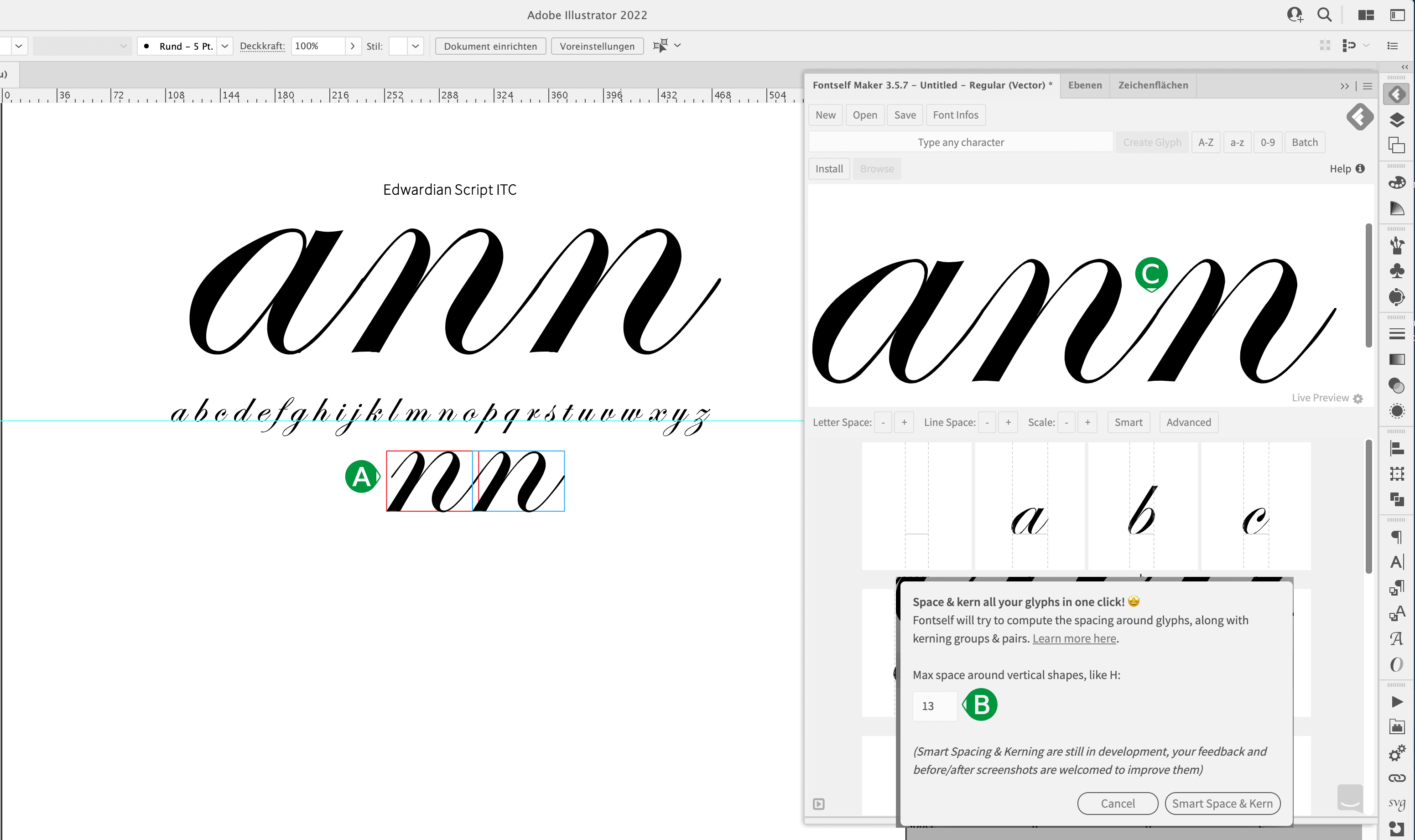
In your example, the left stroke of the “n” begins before the letter. In my example with the Edwardian Script ITC font (which looks extremely bad when enlarged), the left stroke of the “n” begins later. (see ( A ) ).
( B ) For the ITC font, I tried out the SMART (space & kerning) value for Max Space and found it to be “13” for the example. Than the “nn” looks fine ( C ).
For your font you will have to find a different value.
Good luck
1 Like
Thank you for your time and great help!
Think I might be onto something, I’ll keep trying!
Thanks again! 
//Sanna
1 Like