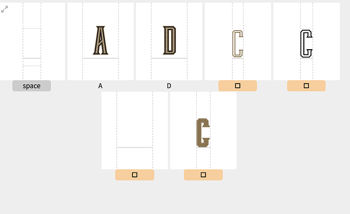
I created a color font that has 4 layered strokes with one being used as a mask for the horizontal with bars since pattern fill aren’t supported. I can drag in some that look perfect but most either omit the masked bars or separate strokes out into separate glyphs. I’ve started trying it as a bitmap in PS but afraid it will look bad in print headlines.
Layered strokes separating
1 Like
Please have a try with Object > Flatten Transparency in Illustrator or some of these tricks: https://help.fontself.com/en/articles/2841382-unsupported-objects-features
1 Like
The expand and merge did the trick! Now I have to go back and do the same thing to the characters that seemed to have worked until I saved out the font. The spacing got weird on those because of the masked bars extending out.
1 Like
Awesome. Hopefully the kind of tricks we can iron in the future and automatically fix without human interaction 
1 Like

