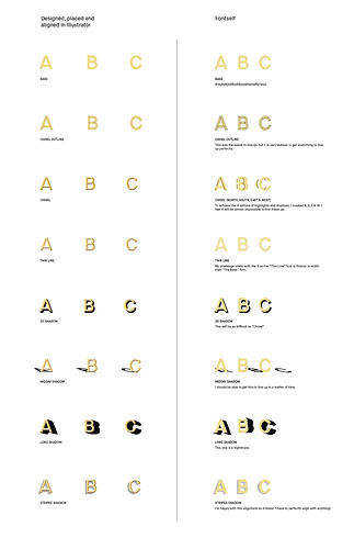
Hello. I’m working on a typeface which layers features, or styles, or shadows on top of each other for a 3D effect. I’m happy with how it looks in Illustrator but am running into a lot of problems when trying to bring each feature into Fontself and getting the styles to line up with each other. I’ve attached a side by side comparison of where I am at and you’ll clearly see I’m struggling. Has anyone tried this before?
Layering Type features (or styles)
1 Like
Looks good. Is it only one font or did you layered the fonts?
1 Like
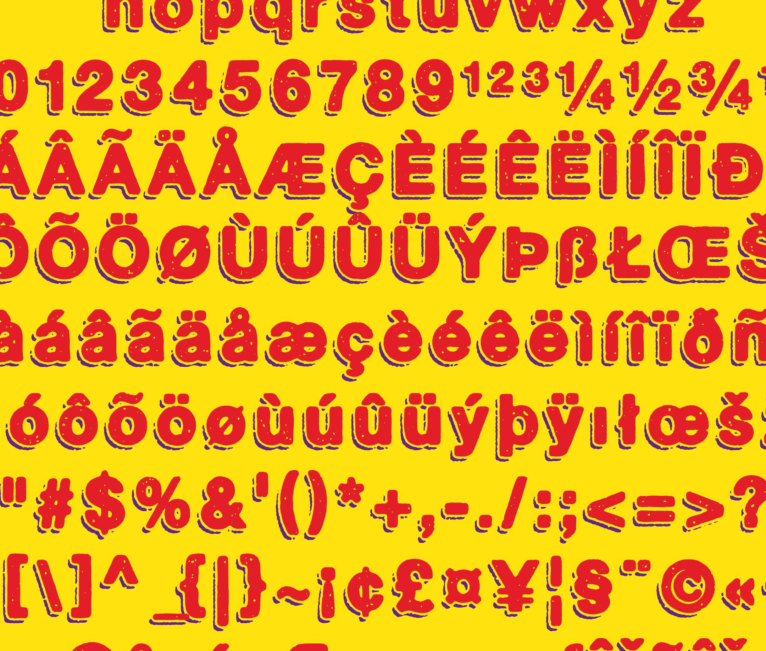
Thanks. It’s two separate fonts, layered.
I imported metrics and kerning from the main font to the shade font, and since I added all the glyphs with the same ascender, descender and baseline I just had to adjust the left and right side bearings.
Oh, it’s A LOT of work, but it’s doable.
2 Likes
Thanks rbrt. I’ll give it a go.
2 Likes
Good luck! 
1 Like


