I’m having an issue where my font seems to have a lot of unwanted leading between lines. When the text runs onto another line, there is a very large amount of empty space under each line, as if the leading is set very high. You can even see it in the preview in the Fontself extension: the text is smaller in the window and pushed up to the top with a lot of white space underneath. When the installed font is displayed in a font list in various programs, the preview is small with a big gap underneath. My descender value is only a fraction of my letter height and I’m not sure what is causing this or how to fix it??
Leading Issues / extra space underneath text
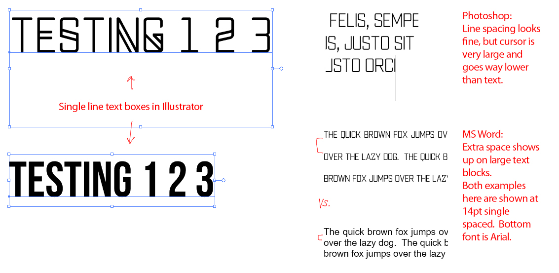
To amend my original post, spacing between lines when text is on multiple lines actually appears to be fine, however, as you can see in this screenshot, the text box shows a lot of extra space underneath the text. The text cursor (not shown) also appears very large, descending way below the characters.
First off, very cool looking font  Looks like something Mastodon would love
Not sure how helpful I can be, but first thing that might help is asking how you are setting this file up? Have you used the template that comes with FontSelf or have you used your own guides in Illustrator?
If you’ve used your own guides I would maybe try only using a baseline guide, with the characters (so far at least), looking like its a display type, all in uppercase, you don’t really have a need to include a descender or ascender for that matter.
Using just one guide,(your baseline) might anchor all your text lower as its the only value it needs to consider. That’s how I’ve created all mine and I haven’t had the issue you seem to be having. You can also set the ‘Line spacing’ in FontSelf (you’ll see that on the main home tab or when you click the ‘advanced’ tab/button.
To be honest, if your text looks fine when you type multiple lines (test it in Illustrator, Photoshop, Word, whatever) then its maybe not too big of a deal?? If your cursor is very large that indicates it might be a type and input setting on your machine that could be causing an issue?
Hope that helps?
Rian
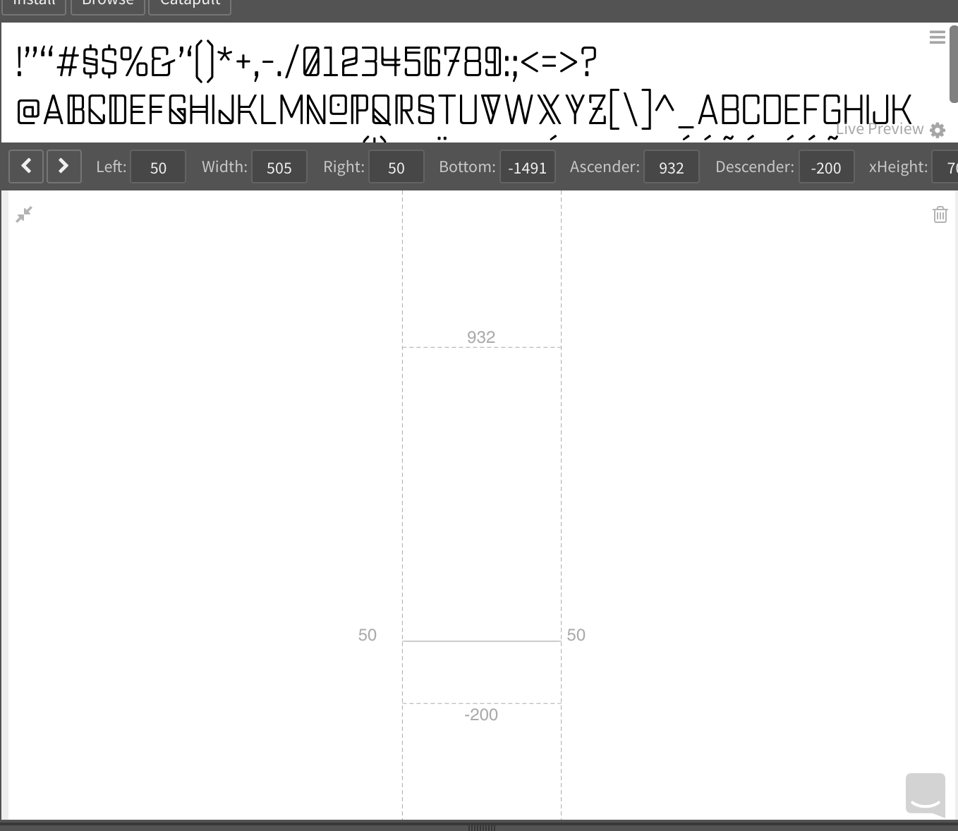
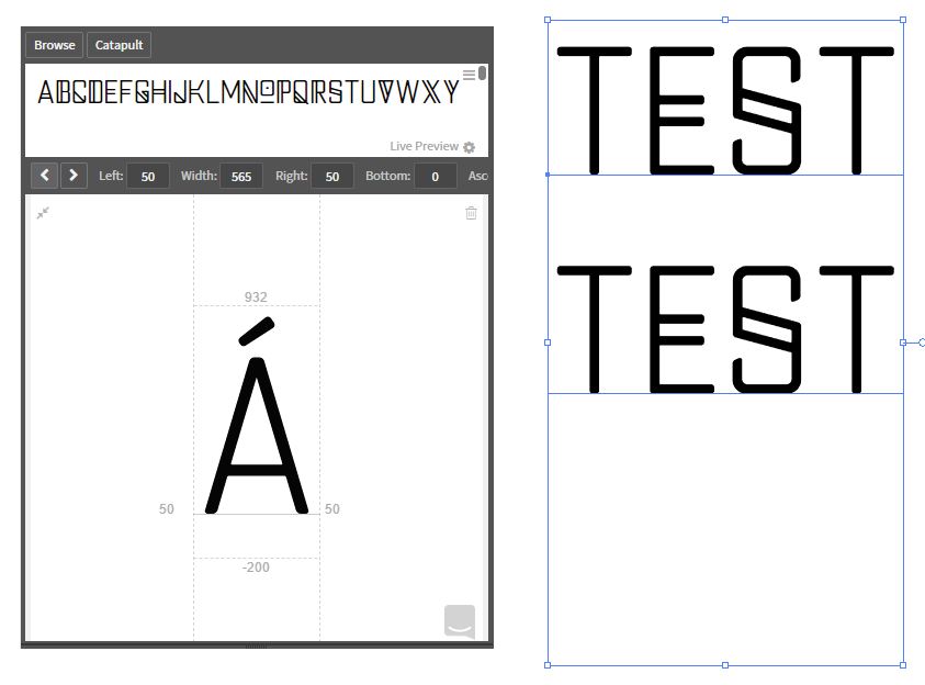
So, I did not use a template but just did it from my Illustrator file. I actually did make it with justa baseline guide and no other guides. There is a bit of an ascender/descender, but only to cover special characters like the tail on the Q and accented letters like É…but not enough to create the large gap I’m seeing.
I tried lowering the line spacing in the advanced tab, but it made no visual difference before not allowing me to lower it any more. Overall, multiple line text ends up looking normal in the Adobe products, so it’s not a huge deal, just annoying. However, it does not appear correctly in Word. Please see attached image for further examples.