Ligatures or alternates?

Hello there,

I am currently working in a startup, and back in march, I’ve created a typography for them. Their request was a type where we can use 2 Q and 2 O, one normal, one with the logotype of the company (The On/off inverted to make a Q). I am a complete newbie in font making so I did it in an easy way, I put the normal Q on the Q, and the Logotype on a glyph that nobody needs here and easy to access on the keyboard (§).
Only now, we realized that when we write the special Q, people who doesn’t have the font installed, only sees §. Which is a bit problematic.

So I decided to take more time to think about the right solution. And I updated the font with alternatives glyphs. And it’s working awesome on adobe softwares. But, to use in microsoft softwares, or even Pages, it’s impossible to use the alternatives. Nothing works, and I’ve been trying to find a solution all the weekend. I don’t find any tutorial or explanation explaining how to create an opentype font that is working everywhere.

I also found information about Ligatures. Maybe it is a solution, to settle the Q logotype to appear only when we write the name of the company. But how to do this ? I only saw people speaking about ff, ffi etc, not an entier word of 8 letters…

If someone can help me to find the best way to do to make a clean type I will really appreciate it.

Ovie

I understand your frustration, but this is the reality with MS Office. I;m not sure what exactly is the support for discretional ligatures (this is what they’re called) - as opposed to standard ones (ff, fl, etc). Even if you create a DLIG OpenType feature in your font - which is really easy (just not sure how to do that in FontSelf) to replace N_A_M_E with a choice of graphic (really whatever you want).
But unless MS or Pages support discretional ligatures you’re out of luck.
Meanwhile - how to create Ligatures in Glyphs

https://glyphsapp.com/learn/ligatures

Actually it is quite easy to create ligatures in FontSelf (just tried adding a ligature for ABC by creating a graphic, dropping it in FS and specifying its name as A_B_C. You only have to create the letters you are substituting first along with the “underscore”. Then FS asks you whether you like to add Discretional or Standard ligature.)TestLig.otf (3.4 KB)

Unfortunately I do not own Word nor Pages so I cannot test. You can try to install this experimental font and see what happens when you type ABC in your program of choice.

EDIT: Unfortunately, for some reason it doesn’t work even in Illustrator :confused:
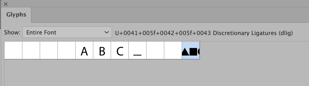
. Not sure what I did wrong. The ligature looks like this in Glyphs panel of Illustrator

It might not work for you, but in my case, I managed to make it work !
In fontself, I created a ligature for the entire name of the Company (8 letters), and the Q is different.
I created it as standard ligature.

In MS Word, I just had to allow all ligatures, and everything works.

It solves the biggest problem I was having. Now my workmates can use the font, when they write the company’s name in a mail or document, the logotype change automatically. And the receiver of the mail, who doesn’t have the font installed, can see the name without the logotype, but still can read the name properly. So it’s perfect.

The only sad point, is that nobody (except me, who is using Adobe) can change de Q for the letter or the logotype to any word they want.

But thanks for your answer ! It was very helpful :slight_smile:
Good enough for the task I had to do ^-^

1 Like