Hello fontself team,
long time not heard from me. But now I’m here again ![]()
There’s a company, willing to publish my nice font family ![]()
![]()
But they want me to add a lot of exotic special characters.
Opportunity for me, to test your latest beta.
First of all, let me say, kerning groups is a bold improvement!!!
I like this so much.
Even when I have to delete all kerning first to work with groups,
it’ s still a great benefit!
Thank you guys very much for adding this highly appreciated feature ![]()
But … you know me … I wouldn’t be Hybi if I wouldn’t have to mention a few issues I detected while working with the newest beta ![]()
First is just a little display inconvenience.
Look at the screenshot:
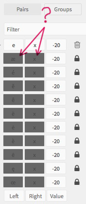
Those fields are much too dark, so I can hardly identify the letters.
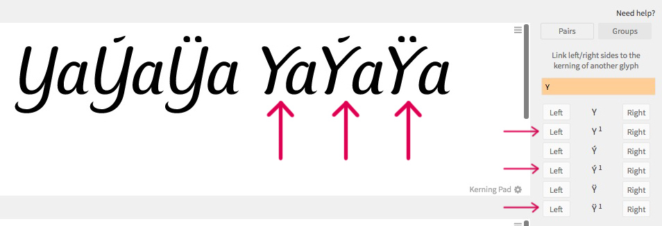
Second is a serious problem:
Working with alternates doesn’t behave as expected.
I can’t put in alternate characters into the corresponding fields.
Third and last complain is an issue that’s been alive since I’ve startet to work with alternates.

While kerning in the work area above is shown properly,
it’s not in the preview area below!?!
More to come soon ![]()
Keep on with your fantastic work hurray ![]()
Best regards
and friendly greetz
Hybi