When I send my font to the Myfonts, Font Validator offers to correct me the following errors:
-
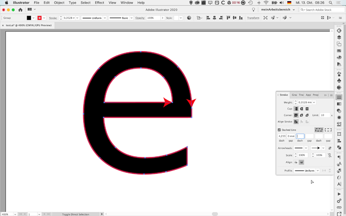
To ensure proper functionality for customers, the paths that make up your glyphs should not intersect themselves
-
To ensure proper functionality for customers, the paths in your glyphs must have correct winding directions. Wrong path directions can mess up counters. Paths need to be oriented counter-clockwise, counters need to be oriented clockwise.
-
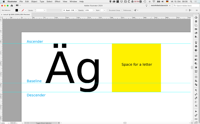
We’ve tested your fonts to ensure that when used on Windows, the ascenders and descenders will not appear clipped or cut off. It is good practice to ensure that your vertical metrics also accommodate your diacritics.
What kind of mistakes is and is it possible to quickly correct from them?


