Hello Fontself team,
thanks a lot for the newest beta. Yes, it’s indeed much faster at spacing and kerning.
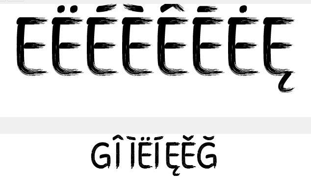
But there’s a bug: Accented characters (ÄÖÜäöü) that are imported via batch and named afterwards are vanishing immediately
Importing them one by one and naming them by the „Type any character“ bar works fine.
Also naming them already in the layers pallette of Illustrator before importing them to fontself is working (but not my usual procedure).
Please have a look at this.
Great weekend to all of you and thääänks again
Hybi
Both lines should be the same characters.
No matter if I paste in or type manually.
It’s both residing in Spacing and Kerning area.
I restarted Illustrator - didn’t help.
And a little(?) request:
Again Kerning is painfully slow.
Maybe because of the complex characters with at least hundreds of points.
Would be helpful, if I could switch refreshing off temporarily.
Thank you so much for all your hard work!
Have a nice weekend
Just confirming this issue was related to the Apple logo character, which is squatting some PUA space and who’s support should now be fixed in recent versions.
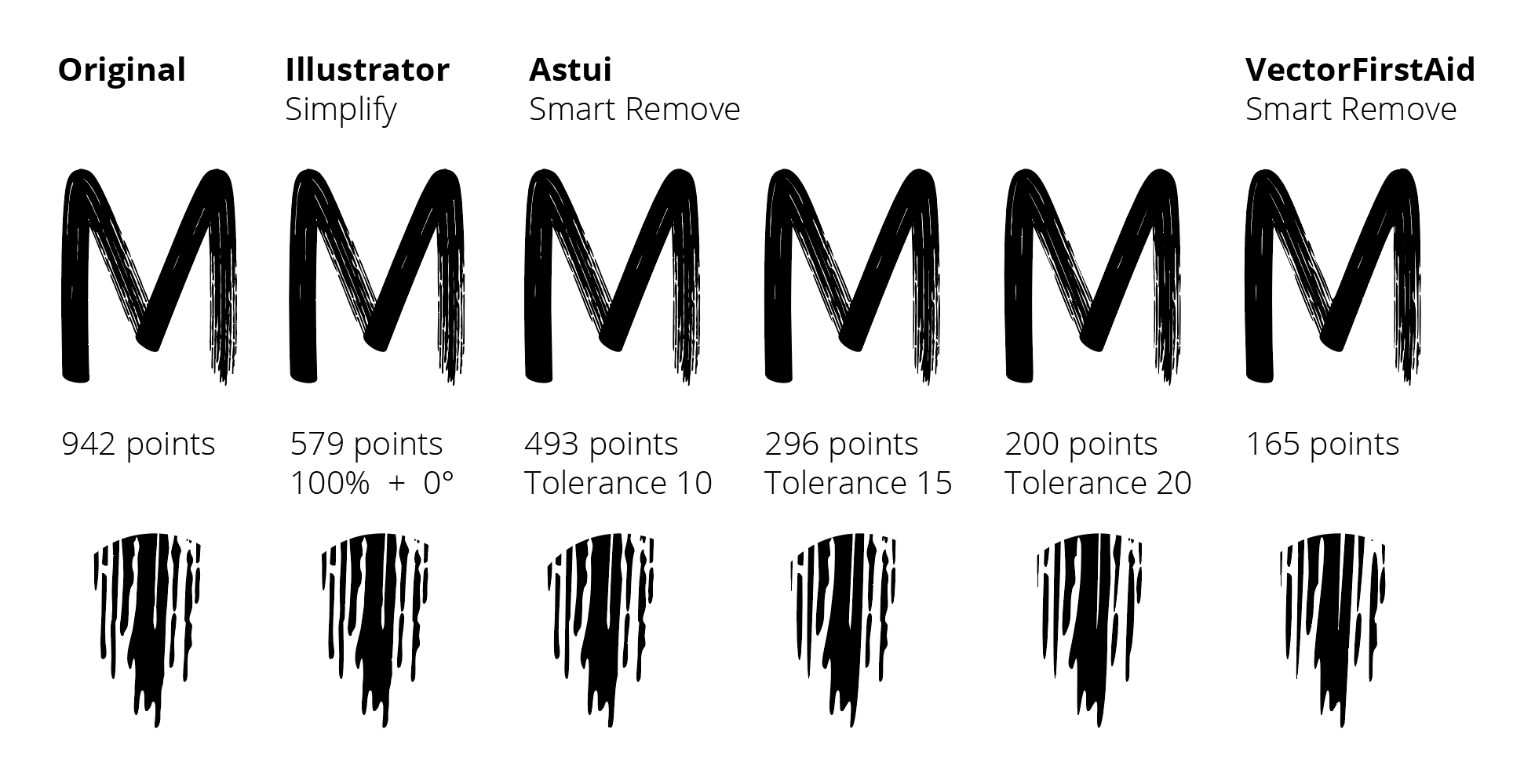
Now regarding speed, we cannot deactivate the refresh for now so the only way forward is to simplify the shapes in Illustrator (if they are named properly, you could totally replace the older versions with the simplified ones while keeping all metrics & kerning).
Here is an example of different approaches I tried, with Illustrator’s own Simplify tool (setting Curve Precision to 100% and 0° Angle Threshold), and using two plugins from Astute Graphics, the promising & powerful Astui and the easy VectorFirstAid.
my own attempts with Illustrator’s Simplify tool has been disappointing.
In some cases 100% was leading to more points than before
And less than 100% was damaging important details very soon.
So I will test the mentioned tools. Thanks a lot for these tips!
Just to clarify, AI’s Simplify tool will indeed usually lead to much lower fidelity results unless you combine the Curve Precision of 100% with a 0° Angle Threshold, in which case you should be able to reduce point count with little loss on such a textured font.