Hopefully this guide I’m creating will be helpful for others who are making pixel fonts and trying to use Fontself to create them in Illustrator.
I would appreciate any feedback on the document. Right now I’m mainly looking for feedback on workflow, mostly because I’m trying to keep the font tweaking to a minimum while I work on the graphic design for the project that will use the font. So if I can make things efficient, I get to do the fun stuff, not the font stuff.
Caveat: Please, no quick takes, and stay on topic! Please read the post, open the illustrator file, ideally try the workflow before posting. If you post a long professorial rant, you obviously have too much time to waste and I will put you to work!
My questions are all detailed in the AI file, but to summarize them here:
What’s up with AI Image Trace not being able to work with small bitmaps?
Is it useful if Fontself could remove white background for you, or ignore it on Fontself import?
Grouping glyphs is annoying for regular fonts, but pure hell for pixel fonts, which have diagonals that break groups.
Can someone please explain how sizing works in Fontself. I’m custom resizing to the template doc, but I don’t know why I’m doing that.
A final question: Is there really no way to do this in Photoshop+Fontself, which would keep everything nicely in the world of raster art? I have tried, but it will only output a bitmap font, which aren’t compatible with most design programs. And it’s blurry.
My Workflow (as of original post)
Develop pixel art alphabets (in Aseprite, Photoshop, anything but Illustrator)
Screenshot alphabets (at large enough size that image trace will work)
Paste/Import Screenshot into Illustrator (Template Doc)
Run Object > Image Trace > Make & Expand (get a larger screenshot if this doesn’t work)
Remove Background (click white exterior, Select > Same > Appearance, then delete)
Ungroup Objects (you may have to do this twice)
Group Individual Glyphs (They will be separate objects wherever pixels don’t abut directly; watch for any diagonals)
Resize Art to match Cap Height of Template Font (with all styles grouped, match largest size)
Import Glyphsets into FontSelf
Save Font
Stop reading now and go into the illustrator file. Then, please do comment if you have any thoughts on how I can improve the workflow. More context follows, but I’m not really looking for feedback on the project at this point. I will soon though!
I promised some context. Please use this to answer your own questions but let’s not muddy the tread. If you’re interested in the project, just reach out to me. If you’re interested in the font, I’ll do a show and tell when it’s further along next year.
The font is for a personal design project with educational/informational content:
As you can see I’ve been using pixel fonts, free ones I’ve found online. For consistency’s sake, I’d like to use one font system for the body text. So I’m developing a font with different styles for each pixel height. 1px - 18px will be in 1px increments, then I’ll start skipping larger increments. Seeing text in the 1px style will be interesting!
The font is not authentic to classic pixel fonts, and will have all sorts of cheats that will annoy purists. Eg, sometimes there will be pixels that stick out of the standard sizing. But I think it will have some utility.
Hello willcapellaro,
First of all, thank you for the presentation of your workflow. It is always interesting to read how others approach certain problems.
Now I would like to answer your four questions.
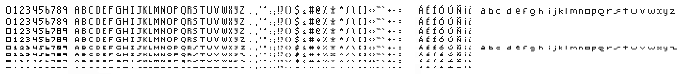
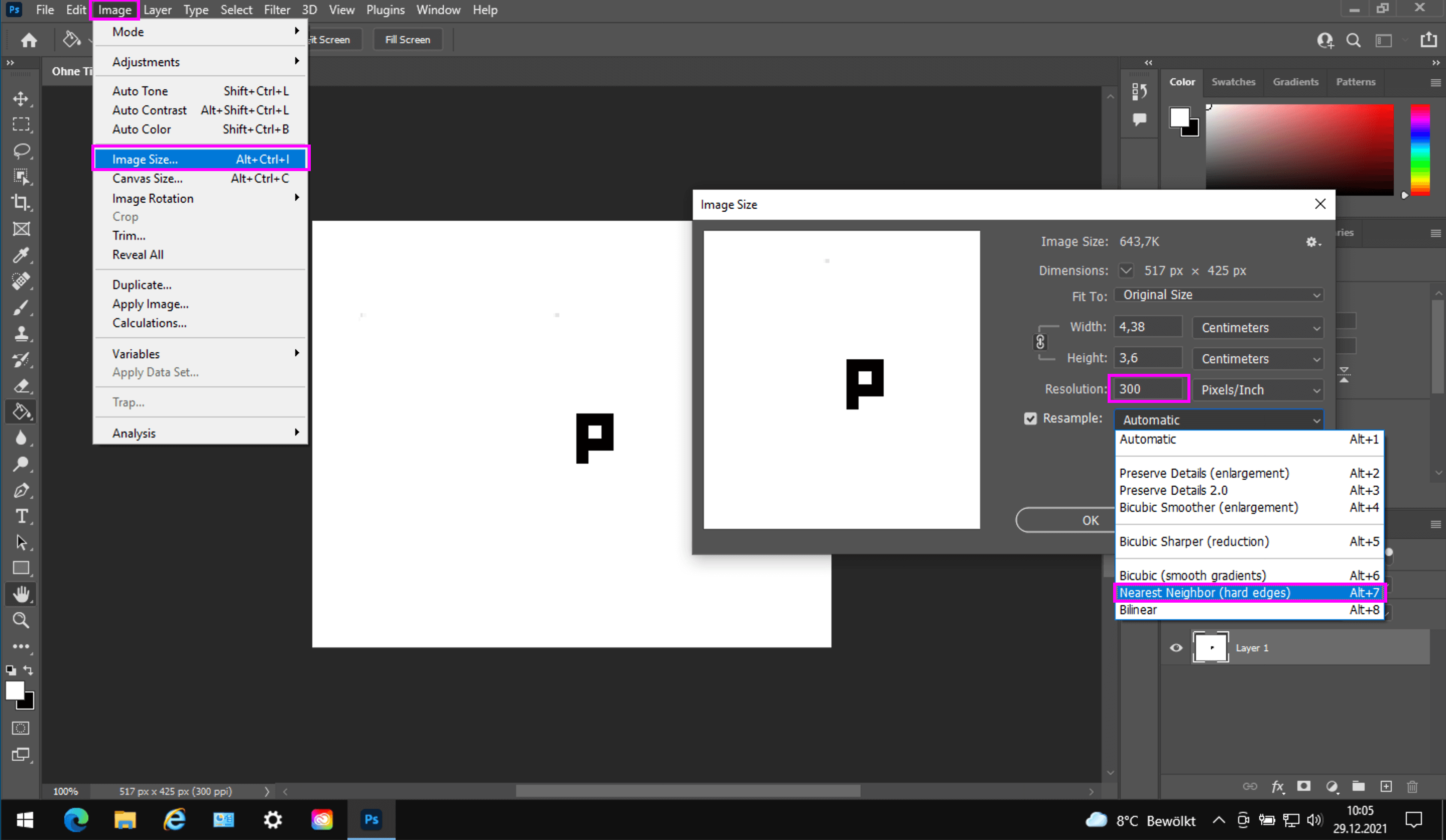
A bitmap image to trace for a pixel font in Illustrator should have the following properties:
• 300 dpi (if it has a lower resolution, then enlarge it in a bitmap programme, but the edges must remain sharp. So use for resample »Nearest Neighbor (hard edges)«.
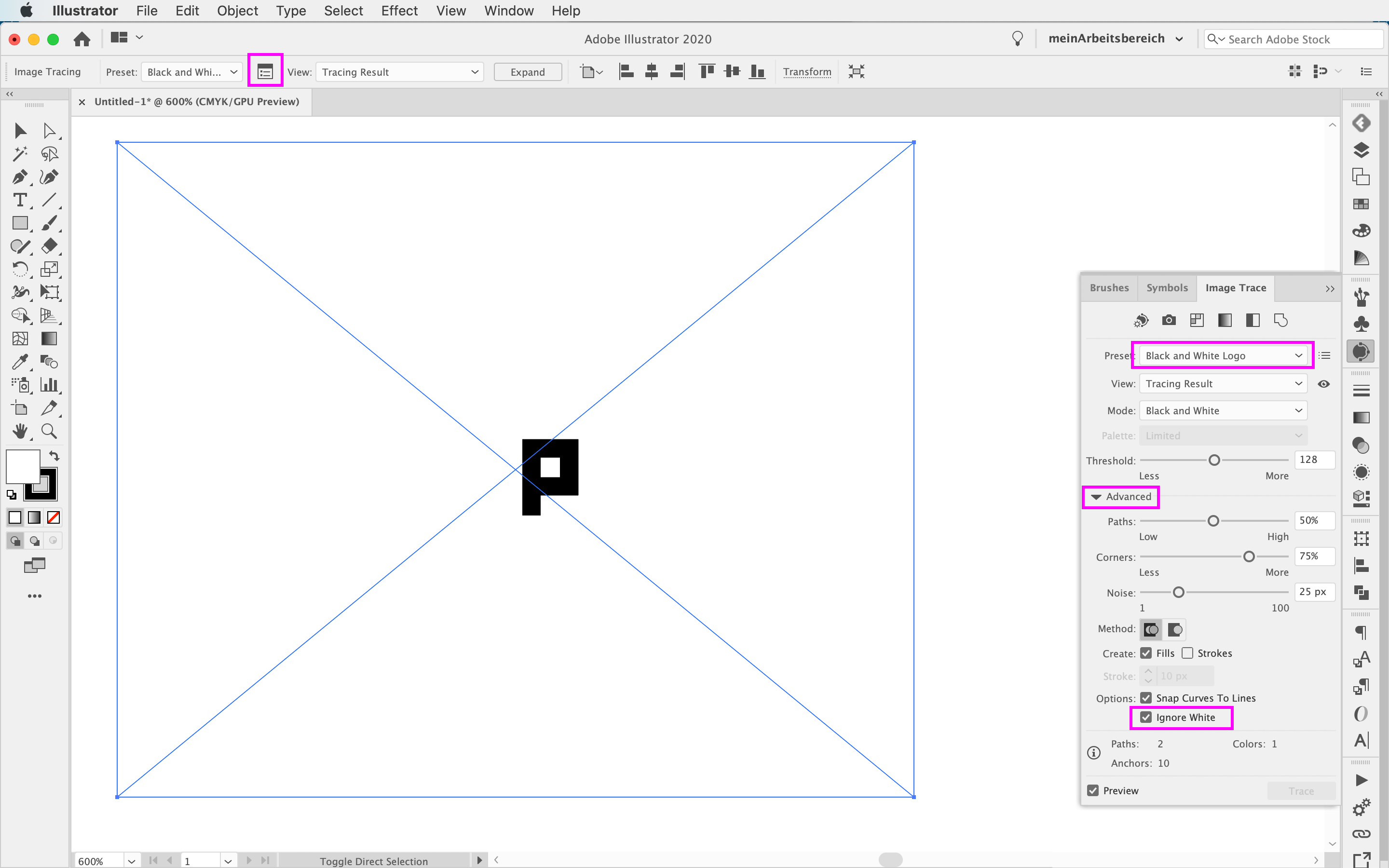
If you leave the white background as part of the letters, Fontself will create a coloured font. Only with pure black letters you will get a monochrome font. Therefore, remove the white beforehand. You can do this by forcing the image tracing as shown above.
I always put the elements of a letter together as a compound path. For this I use a self-written Javascript that uses the name of the top element for the name of the compound path. This saves a lot of time
(I just noticed that the Javascript is not yet published on my Behance account https://www.behance.net/jensulkriebel. I will do that later). I will do that later).
There is a trick in Fontself to make a font correspond to the size of 12 pt. Use a square as the very first character that has a size of 70 % of 12 pt. This has been explained several times in the forum, see
About your workflow. I think you are taking too many steps. Everything can be solved directly in Illustrator. You can do without steps 2 - 6.
(I have created a matrix font in chapter 7 of my German book on Fontself (see http://www.computergrafik-know-how.de/font-design-buchvorstellung/)).
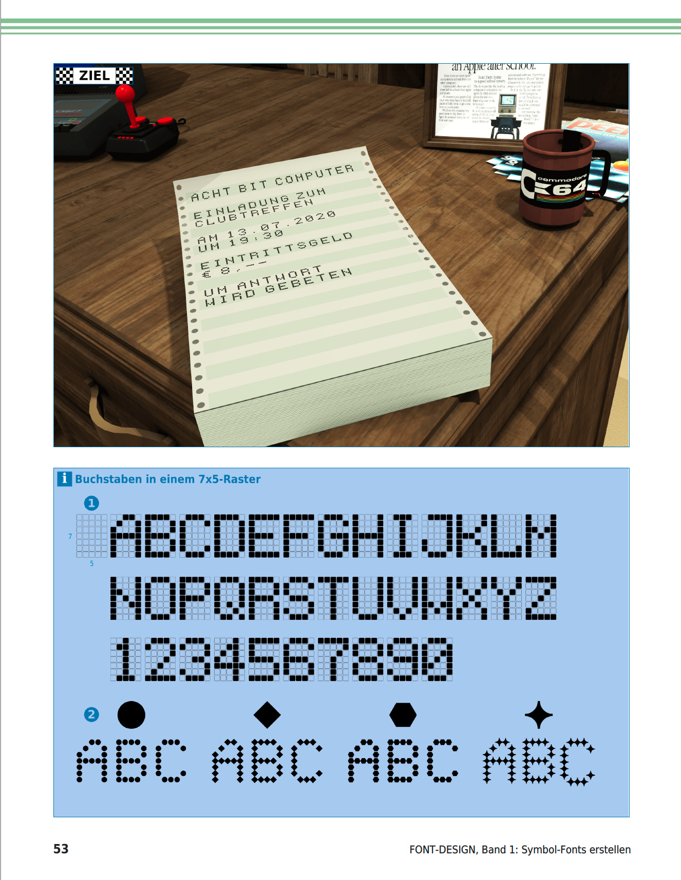
To do this, (1) I created my own 7 x 5 grid and then filled the necessary fields with black symbols(!). This allows you to quickly replace the type of grid points (2) with a different shape, as shown in the image above.
Addendum: The free javascript “CompoundPath.jsx” creates a compound path with preservation of the name in Adobe Illustrator 2022 and also runs with older versions of Illustrator. The normal command in Adobe Illustrator “Object > Compound Path” unfortunately automatically gives the object a new name, so the user has to change this again. This is especially annoying when designing fonts with Fontself Maker, as the names of the objects become the names of the letters (glyphs). The Javascript “CompoundPath.jsx” presented here receives the name of the topmost object and thus saves a lot of time.
Some good input here. But I can’t tolerate trying to do pixel editing in illustrator. I’ll give it a college try at some point, and report back. Hopefully I can stomach it.