Hello folks
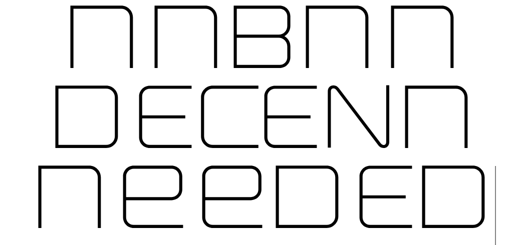
I’m currently reworking my Ronduit Capitals font, with the idea of adding a few more weights and I logically started from Light one. I’m experiencing some weird spacing around letters like D and lowercase n e - can you please suggest a workaround. Of course, I can tweak these three after I’m done with the whole font, but curious why FontSelf behaves like that.
Thanks!!! If needed I can send over the font file.
Hello, I have vectorised your letters in Illustrator and created them as a font.
Directly after the creation, the spacing looks good to me. If you apply “Smart” kerning with the max. value of 222, then I get almost your spacing. There seems to be no error in Fontself. However, a smaller spacing would make sense for optical reasons.
To improve the spacing between “D - e” and “n - e”, you can go into the settings for “e” and make the space to the left of the “e” smaller, or you can use the kerning settings under “Advanced” for the letter pairs that seem problematic to you.
Good luck, Jens.
Thank you, Jens - my setting was 125 to be exact. My question was more about the fact that the other letters seem well spaced by the Smart function and only these 3 seem off. I’m attaching my font here for you to explore, no worries.RonduitNeue-Light.otf (43.2 KB)
I’m not trying to say that Smart is not working, it’s just weird why it applies such spacing/kerning for these glyphs. Other fonts I’ve created with FontSelf have good smart spacing/kerning.
Thanks!!!
I think that the letters should have a fixed, equal distance right and left. Because your letters don’t have any parts that need kerning (see Kerning - Wikipedia). Your font is almost a mono-spaced font, with a few exceptions, because there are almost vertical lines. The exceptions are “AW”, “AV”, “WA”, “VA”. I clicked “Reset” in “Advanced” and set all letters to a white space of “125”, then your letter selection “De” and “ne” looked fine.
Even though the “Smart” function works well in many cases, there are exceptions, like your font, where “Smart” does not give good results.
Best regards, Jens.
Thank you very much for the response, Jens - especially on the weekend! Yeah, you’re right - I was too blindsided by the willingness to save me time from kerning and spacing  With 65 set on both sides and adjusting few characters I’ve been able to achieve a uniform look.
Thanks!!!
1 Like