Spacing or Kerning for the numeral "1"

Hello. I am trying to create specific spacing for numerals that will be used for a digital time display. The time will be displayed as two digits for the hour, with two digits for the minutes directly below the hour digits. Is there a way to alter the spacing for the numeral 1, depending on whether it is either the first or second numeral in a display? All of my font numerals are the same width, except for 1, which is half the width of the others.

Ultimately, I would like my spacing to match the attached mockup image. When 1 is the second digit, as in “01”, I want the numeral to occupy the left “half” of what would be the other numerals’ width. If 1 is the first digit, as in “10”, I want the numeral 1 to occupy the right “half” instead. Hope my attachment helps clarify my awkward wording. Can this be achieved through a combination of spacing, kerning or ligature settings? Thank you very much in advance - I appreciate any help!Untitled
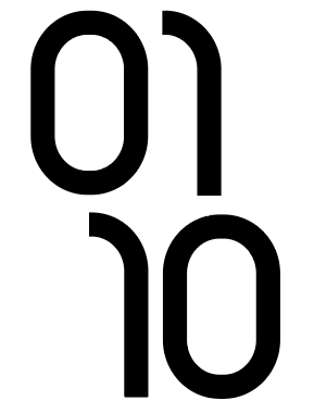
Hey bud. Awesome looking font by the way. There may be other ways too do this, but here are the two methods that spring to mind for me. First, would be to set up kerning pairs for each of the number combinations you need. Not sure how accurate you could get it, but may be a case of setting the left hand bearing for the number that will be on the left first. i.e. in your example above for all the number pairs that start ‘0’, set the left bearing to 0. For all the numbers that start ‘1’ it looks like the left bearing might be 50% of the glyph width. Would take a bit of experimenting and tweaking for each of the number pairs. Maybe setting the left and right bearings to 0 when you create the glyphs would allow better accuracy as you’d be working with values and bearings that are tight against the numeral glyph to begin with. I hope that makes at least some kind of sense haha

The other method (and probably a lot faster), would be to manually create ligature glyphs for each of the combinations that you require, making sure you have the position and spacing exactly how you want it in the glyph graphic (vector or raster) before creating the ligature.

There’s possibly other ways to do this, but those are the two methods that I can think of. Hope it helps!

1 Like

Hi Rian. Thanks for the quick response and great suggestions! I think I’ll try the ligature glyphs method first, as it sounds to be a quicker approach. I may try the kerning pairs option too, just to compare. Both will be a good exercise for me to learn more. Thanks again for the detailed steps!

Hey Tyler, no worries at all my friend, I hope its helped and that you’ve managed to get things working as you hoped! :smiley:

1 Like

It worked great - thanks again for your suggestions. I ended up only having to manage kerning pairs for combinations with the numeral 1, so ended up not taking too much time after all. My digital time display works exactly like I had hoped!

incoming-D9A9B65F-B62B-4489-9D82-9EBF25CA1446