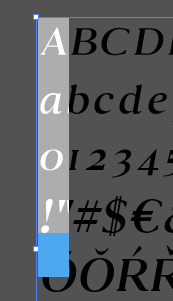
I exported a test version of the italic variant on a font I’m working on. In the screengrab attached only the capital letter “A” is selected yet the highlight area extends down several lines of text further. What have I done wrong? How can I correct this and can it be done globally or will I need to do this to each individual glyph?
Ok so found the issue: lots of accented characters have been imported but are flying all around the baseline, leading to a giant overall glyph size.
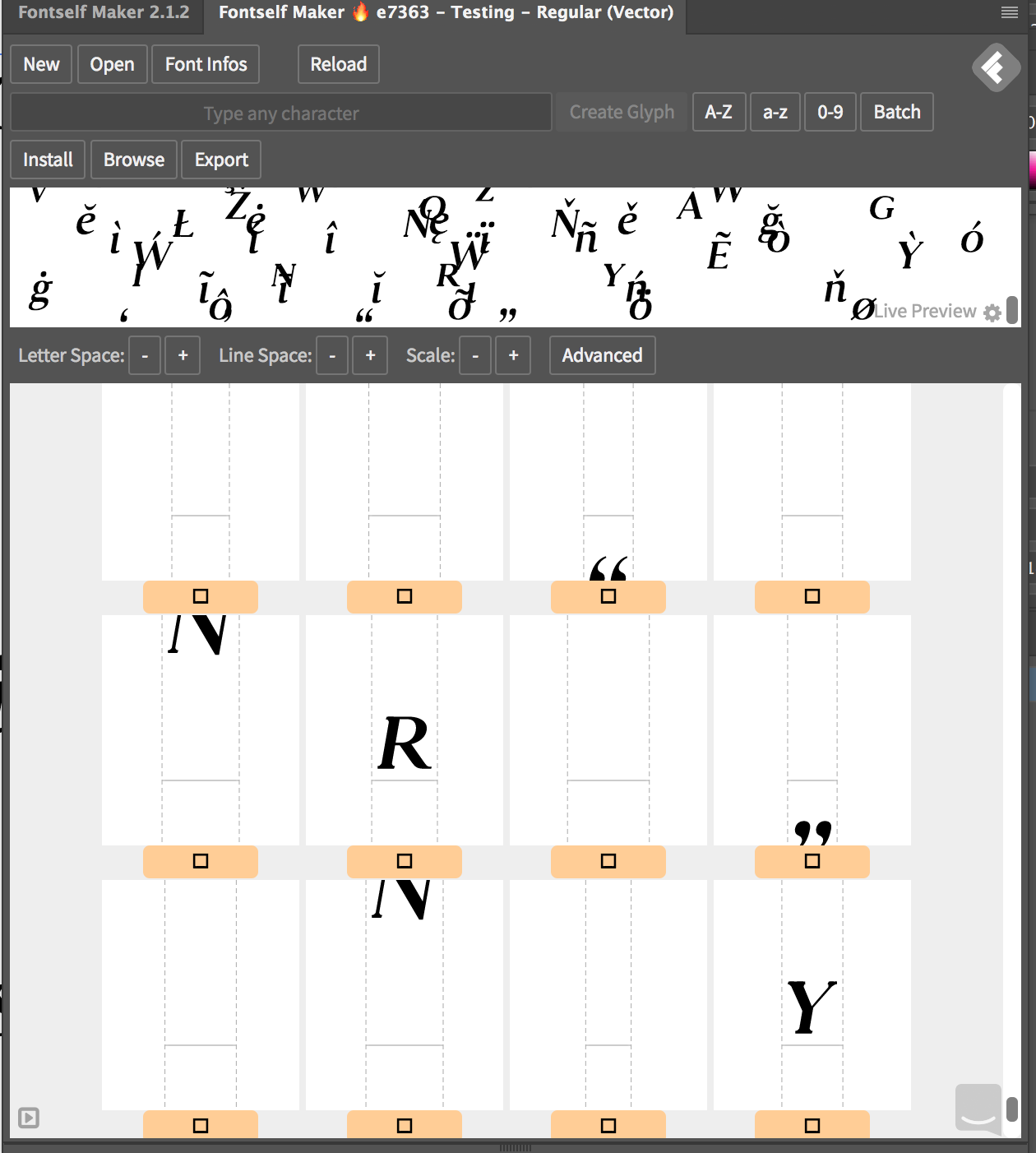
I guess you’ve imported objects that were not aligned, and Fontself currently places them relatively to a unique baseline, which explains why some are flying high and other are below the baseline:
The simplest way to solve this is to either to delete these extra glyphs or start from scratch, and then only import characters that are part of a single line. I also recommend you to use a ruler guide to precisely define the baseline: Set font metrics with Illustrator guides | Fontself Maker Help Center
Hopefully we can one day detect such issues and warn you about them right in the app