Hello everyone!
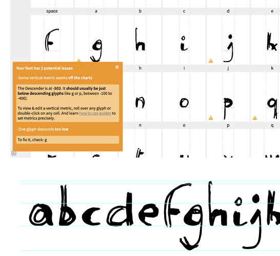
I’m new to Fontself and have a few questions about vertical font metrics and guides.
When creating guides for Baseline, Ascender etc., I used the sample lettering from the Welcome Gazette document in Illustrator. But I keep getting warnings that the Ascender is too high or the Descender too low. But if I fixed it according to the Warning, some of the letters, like the “g”-Descender, would be crammed, or go beyond the descender line…
Also, I don’t even know what units are being used, it only says “between -100 and -400”.
How can I know the correct maximum position of the guides before importing glyphs? And what if I want my letters to have longer descenders then suggested?
Also, when I change the line height in the fontself window, can this somehow be adopted to my guides on the artboard?
I’m really sorry if this is a dumb question, but I couldn’t find anything like this in the forum.
Thanks!

