
Work in progress, looking for some feedback
The letterform speaks movement and most certainly fits extreme sports and racing.
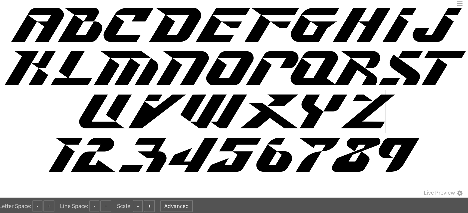
You missed the “0” and the lower left corner of the W is a bit different from the other letters.
Overall, nice work, mate! 
This looks very promising. I especially like the Y, R, S, 4, 5.
Like @johnmisael mentioned, zero is missing. The 3 is/seems a bit too wide compared to the rest. Also lowercase would be nice.
I have a question: will this font be publicly available? And if yes, will it be free/open source or paid?
Thanks for the feedback @savalina!
The font will be free and open source. I’ll post a link when it’s done.
I’m thinking about lowercase, but since the intention is titling and jersey numbers, etc., I’m not sure if lc is really necessary. Maybe it could be alternates…