Kerning is getting easier in Fontself! We have a new beta that brings its host of improvements to the whole spacing & kerning process:
-
Preview glyph name & Unicode value in Spacing & Kerning views and easily copy the character by clicking on these actionable tooltips (so you can paste any character in the preview and kern it without having to guess the exact keyboard shortcut):
-
All caps fonts with no need to mess with kerning
-
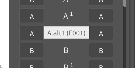
Fixed Kerning Pad bug that displayed wrong alternates
-
Fixed alternates kerning bug when using kerning groups
-
Performance improvements (up to 50% faster to refresh fonts)
-
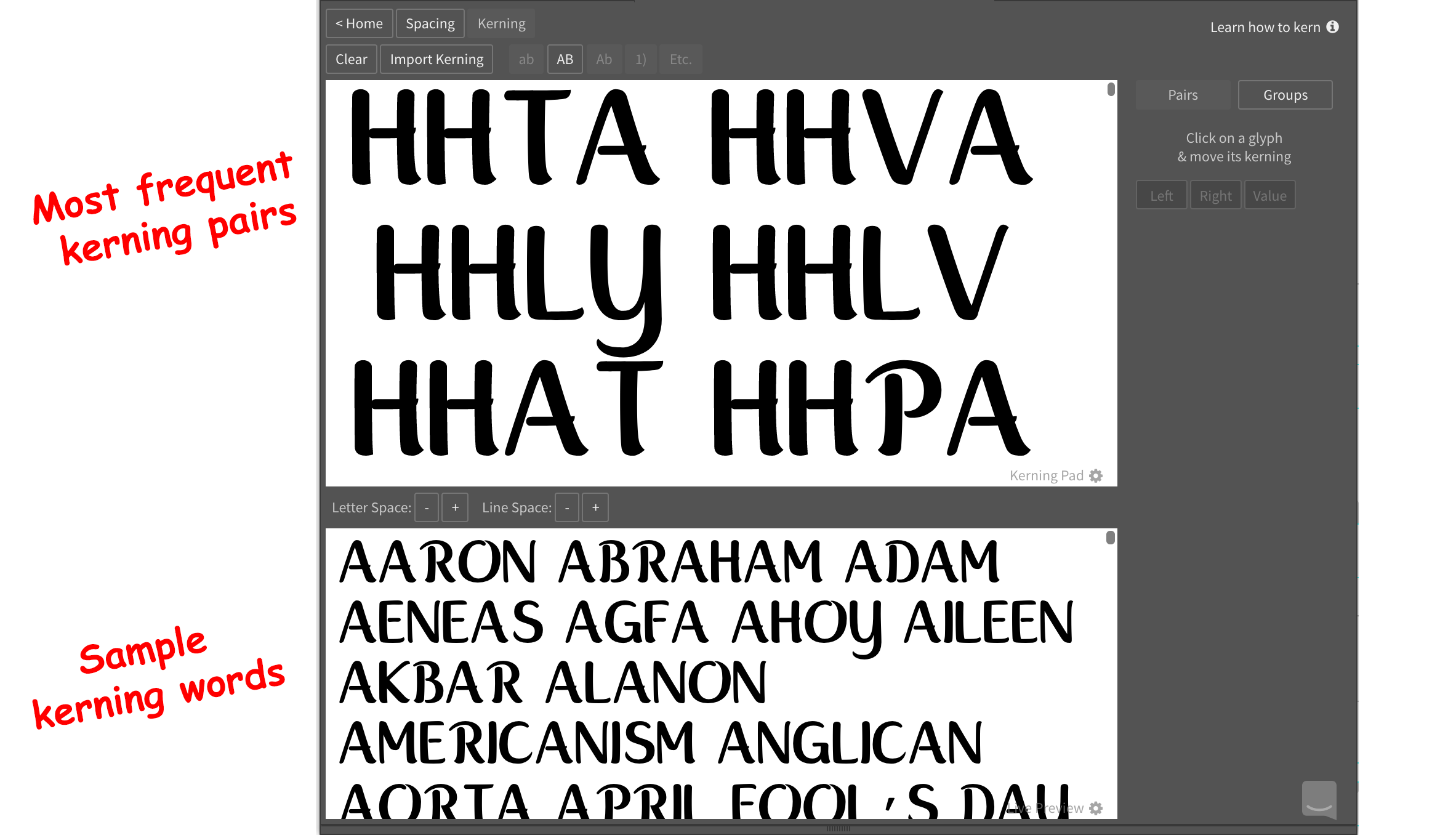
New spacing & kerning sample texts to quick-start the process with the most frequent kerning pairs:
-
And finally, we started working on our help articles to provide you with more practical guides on spacing & kerning with these new features. Please have a look!
We’re looking forward to hearing your thoughts to improve these improvements ![]() @Vocal @Mehmet @AlanP @Monique @itsmesimon @NREY @Sascha @abandonedbywolves
@Vocal @Mehmet @AlanP @Monique @itsmesimon @NREY @Sascha @abandonedbywolves