So I am struggling with punctuation marks. are marks such as apostrophe and quotation marks supposed to sit on the baseline like letters or as I would see them as I type? I try to do both but it either doesn’t reflect properly in the the previews or the area where you can edit your glyph or when the font is installed the marks refuse to display as the intended apostrophe or quotation marks they show up as commas sitting way too low for it’s intended purpose.
Issues with punctuation such as apostrophes and quotes
by the way I find it very interesting how in tutorial videos there is little to almost no mention about punctuation marks that aren;t intended to sit as low as a comma or semi-colon. Is it because it’s not a properly working feature or what?
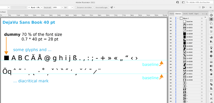
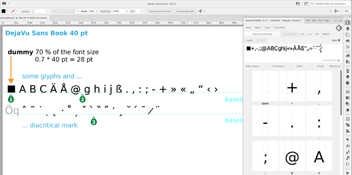
Fontself can handle any type of character, including commas, apostrophes or all diacritical marks.
The “magic” that makes the characters end up in the right place lies in the use of at least one auxiliary line, which must be called “baseline” and is the baseline for all characters. In my example, I have divided the characters into two lines, so I also need two baselines.
If you want to create characters to an already existing character set, then it is also not important that the new characters get the correct size. For this, you create the dummy square, which must have 70% of the font size.
In the “Layers” window, I have assigned the Unicode names to the diacritical characters. And this is what my self-written Javascripts (fontself helper) does for me: Free Javascript for Illustrator: Font-Outline-with-Names.jsx
and Free Javascript for Illustrator: Rename-Abc2Unicode.jsx
My file and font are attached as an example. Good luck. Jens.
Archiv.zip (243.8 KB)
I use photoshop though. Could I get some help from someone who uses PHOTOSHOP?
And I just love how the created font that you attached to the zip file doesn’t contain the issues i am dealing at all.
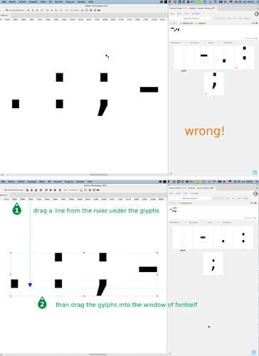
In Photoshop you need a helpline as well as a baseline like in Illustrator. But the line has no name.
instead of the examples that you show me that are never issues ffor me PLEASE SHOW ME THE ISSUEE IN MY title.
Normally I create a new character set in one go. So all (many) characters on a line at once. Therefore my examples were correct, no error in Fontself.
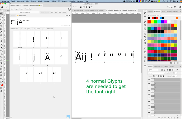
But the current version 3.5.7. has a problem when you drag glyphs to Fontself that are not on the baseline, like quotes.
Workaround: Take at least 4 letters like ABCD and drag them together with your inverted commas to Fontself, i.e.
A B C D ’ ’ " " ’ "
then they all end up in the right place. ABCD may be overwritten.
BTW a screenshot would be helpfull.
yeah i finally figured out what you were saying lol I just wish that the fonts that have ascenders and descenders would display properly in Samsung. I wanted to offer fonts for the themes I create for Samsung users but there is no way I can do that when even though I do everything right in PS and Fontself because the lowercase g,j,p,q,y sits on the baseline instead of hooking below and any character not on the baseline gets shoved to the baseline.
Bitmap fonts are not supported by all systems and programmes. Have you seen the warning and read the accompanying text?
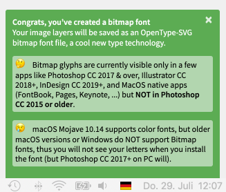
they are supported on Samsung or else i wouldnt keep trying to get this right.

