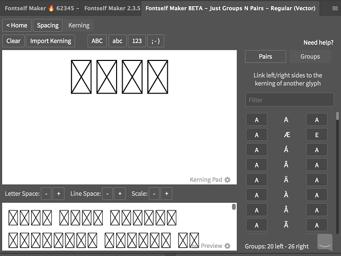
@itsmesimon the beta of kerning groups are currently in Illustrator only, but coming soon in PS.
Your suggestion to improve the Kerning feature
the new kerning feature is a greatest thing ever! Maybe you need to think about same feature for spacing 
hey, where can I get the beta version with the kerning groups? Do I have to sign up any beta group?
Best
Sascha
ps. thank you for Fontself! I love it.
@NREY kerning groups and importing kerning pairs/groups proved to be way more challenging than expected, and bringing that ease of use to spacing as well will introduce many other challenges. So don’t hold your breath on the short term, but we’ll see how far we can go once we’ve pushed everything we have been working on (couple more surprises in upcoming months 
@Sascha just ping us via the Fontself chat or hello@fontself.com to get access to the beta.
done! I wrote you a mail.
There’s a new beta update in Illustrator that fixes a lot of issues when dealing with kerning pairs, groups and when importing kerning (and spacing) from other Fontself-made font files.
As we try to find new ways to make your life easier, we thought about including a predefined set of kerning groups and kerning pairs. Of course, kerning is going to be really different depending on each font design, and whether you have spent a lot of time refining your spacing first.
But in many cases, it may be great to NOT start from scratch. So we’ve gathered in a dummy font file a first set of 46 groups (for both uppercase and lowercase letters). Based on these groups, we’ve also created 26 master pairs - which already results into 382 sibling pairs - for uppercase only for now.
JustGroupsNPairs.otf (44.8 KB)
All these pairs have a minimal value (-1) but you can adjust them (or delete them) based on the specifics of your font.
Right now you will need the new Fontself beta 3.0.0-2 to import this font file from the Import Kerning button.
Warning: when you will import the kerning data, you might be prompted to scale your glyphs. This will happen when glyphs from both fonts have different sizes, so just press Ignore and Import.
So what do you think about this idea of kerning presets? @Hybi @Vocal @Mehmet @mikkomix @wendyzine @Jelle @AlanP @twinbrush @harleycreative @mmnowak86 @itsmesimon @fvnetu @NREY @Sascha
@franz haven’t had a chance to look at the new kerning dummy set up, but just have to give my love for the new kerning groups feature. Brilliant job guys! This feature make life so much easier when adding kerning values to the likes of foreign characters without having to go in and add loads of new kerning pairs! 


Awesome stuff! I’ll give some feedback on the dummy kerning data when I get a look at it! Keep up the great work 
Super thanks @twinbrush ! Happy that you enjoy the kerning groups. Please let us know if you see anything that could make your life even easier.
Love the kerning pairs feature! Would it be possible to update multiple kerning pairs for ligatures and letters alike? I added a BUNCH of ligatures, often with the same characters, and currently I have to set them individually, but since they share similar real estate, it’d be ideal if I could update all at once(or link certain ligatures and characters) based on which is left or right bounds. Could adjusting global spacing values modify kerning pairs and vice versa? In experimenting, I’ve created many kerning pairs, where I end up adjusting the spacing, and having to redo these pairs. For scaling, would it be possible to add at the character level? I made a signature ligature, that ends up at 65% of regular character height, and I’d like to scale up that one character so that it matches, if there is a max width that I’m potentially exceeding, I may be out of luck. Scaling also doesn’t globally alter ascenders, descenders etc which by themselves can be a little difficult to understand their global and local relationships and the impact when editing a single glyph. Seems like I need to educate myself more on the last piece, however with trial and error at the global scale I’m sure I risk destroying my font. 
Hey @abandonedbywolves,
Many questions in your post  Let take them one by one:
-
Multiple kerning
What you need here is to use kerning groups. It lets you define groups of letters that have similar shapes (for left and right side) and then define a kerning for the group. The good news is that this new feature is coming this week as we’re releasing the v3 of Fontself Maker
-
Spacing comes after Kerning
We strongly recommend to work first on your Spacing. And once you’re happy with it, you can start the Kerning. A good spacing of your glyphs will do most of the job and minimize the kerning work. Kerning pairs can bee seen as corrections where spacing doesn’t make the job. -
Scaling at Character level
One simple solution for now is to resize the original object in your AI/PS document and then re-import it for the same letter. Fontself will let you replace the shape without modfiying spacing and kerning you’ve defined for the glyph. -
Ascender, Descender
They are vertical metrics for your font. They are used by text softwares to define the line height of a text using your font.
This article may help you: https://help.fontself.com/making-fonts/set-font-metrics-with-illustrator-guides -
One last recommendation
Save/Export your font periodically. It lets you keep backup versions of your work
- Looking forward to it!
- Agree, but I sure didn’t. It may also depend on the letter art style, since a more monotype font can be primarily adjusted via spacing, but more exaggerated handwritten letterforms might require more kerning pairs. I’ve gone back and forth on kerning and spacing as I work out the kinks in individual characters and replace, but I’ll take your advice as bet practice at this time.
- I was able to resolve based on this advice. I was working with the exact same scale glyphs for all my imports, and for whatever reason a ligature of 4 characters imported smaller than the individuals. Outlining the ligature, scaling and replacing in fontself did resolve the issue after a bit of scaling trial and error. Part of which required changing the font name since I did a finder install of my original font that wouldn’t let me see any change.
- Thanks will look into it! I guess what I mentioned doesn’t completely matter since they’re more of guides, I was just thinking they should scale with the - and + buttons. Of course most of this scaling needs to be handled on the design end, but just hoping to do minor tweaks in the fontself extension.
- Noted! Thanks again.
It would be nice if we could import the kerning from the OpenType-SVG bitmap font, to the exact same font but a traditional vector font.
Currently it ignores all alternatives imported from the SVG bitmap into the vector font (all via Photoshop). Also in photoshop alternatives seem to appear in the panel in the order your create them (rather than a A-Z order), and if you create the alternatives in a random order, then when installed they appear in the photoshop glyphs menu in a random order. That is very annoying for a user, as they are all mixed up. I don’t think this is a photoshop bug, I think its a FontSelf bug
The alternative Glyphs issue is a Photoshop bug and has been highlighted by the guys at FontSelf, you can give it an upvote here:
Thanks, you can actually upvote the other type-related issues and feature requests we have filed to Adobe:
Kerning is getting easier in Fontself! We have a new beta that brings its host of improvements to the whole spacing & kerning process:
-
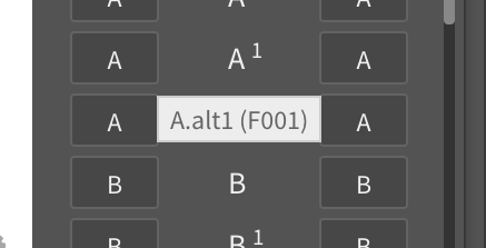
Preview glyph name & Unicode value in Spacing & Kerning views and easily copy the character by clicking on these actionable tooltips (so you can paste any character in the preview and kern it without having to guess the exact keyboard shortcut):

-
All caps fonts with no need to mess with kerning
-
Fixed Kerning Pad bug that displayed wrong alternates
-
Fixed alternates kerning bug when using kerning groups
-
Performance improvements (up to 50% faster to refresh fonts)
-
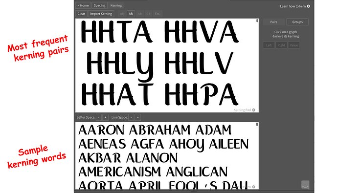
New spacing & kerning sample texts to quick-start the process with the most frequent kerning pairs:
-
And finally, we started working on our help articles to provide you with more practical guides on spacing & kerning with these new features. Please have a look!
We’re looking forward to hearing your thoughts to improve these improvements  @Vocal @Mehmet @AlanP @Monique @itsmesimon @NREY @Sascha @abandonedbywolves
R.I.P. kerning editing. With Smart Metrics in Fontself Maker 3.5, we’re bringing a radical answer to the challenge that proper spacing & kerning editing represents for more creatives:
What do you think? We’re eager to hear your thoughts and testimonials: does the feature live to its promises and how much time could it save you?
@itsmesimon @twinbrush @mmnowak86 @harleycreative @Monique @ipassas @impulsenine @AlanP @mikkomix @Jelle @Mehmet @Hybi @Vocal @fvnetu
That auto kerning looks like a really good feature, will try it out on my next font, how long before we get it on the photoshop version?
Cheers
Simon
Hey @itsmesimon.
No precise schedule for the moment, some technical challenges have to be solve here, but we never say never 
Honestly i am amazed! I didn’t expect something like this so fast from Fontself… It seems that it really strarts to be like a replacement from other professional font design programs…
Personally if this feature becomes a bit more precise i am quitting glyphs 
Amazing guys!! Really the best feature so far!!
ps…Needs improvement of course but i have all the faith for you 
Thank you so much @ipassas for your enthusiastic feedback  .
.
We are sincerely happy that you appreciate this feature! Our goal remains to let you guys feel free in your creation process without being restricted or intimidated by technical barriers.
PS: Feel free to contact us at hello@fontself.com to give us more details about what could be improved.


